
Overview
The basic steps to create an object:
- Selecting the PLC device and setting the read/write address.
- Using Shape Library and Picture Library.
- Setting label text.
- Adjusting profile size.
- Overlapping Objects (cMT / cMT X Series)
This section explains the basic settings of an object.
Selecting PLC and Setting Read/Write Address
Most objects read data from PLC devices, so a properly configured PLC address is needed. Select the PLC to control at [PLC name] which comes from [System Parameters Settings] » [Device List].
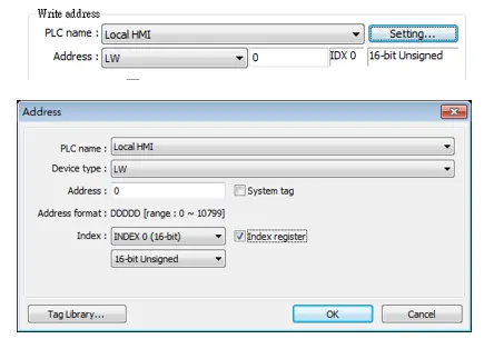
| Setting | Description |
|---|---|
| PLC name | Select the PLC type. |
| Device type | Different PLCs have different device types. |
| Address | Set the read/write address. |
| System tag | Address tags include [System Tag] and [User-defined Tag]. This option allows users to use [System Tag]. [System Tag] consists of the preserved addresses by system for particular purposes. The address tags include bit registers or word registers (LB or LW). After selecting [System tag], not only will the [Device type] field display the chosen tag, but [Address] field will also display the chosen register. |
| Index register | Select this check box to use the [Index Register]. |
For more information about Tag Library, see the Address Tag Library page.
Using Shape Library and Picture Library
In the settings dialog box of certain objects, “Shape” tab can be found. In this tab, Shape Library and Picture Library can be used to add visual effects on objects. Select Shape tab to use the libraries when creating an object.
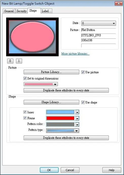
Picture
Select [Use picture] and then click [Picture Library] button to open Picture Manager window and select a picture from the window.
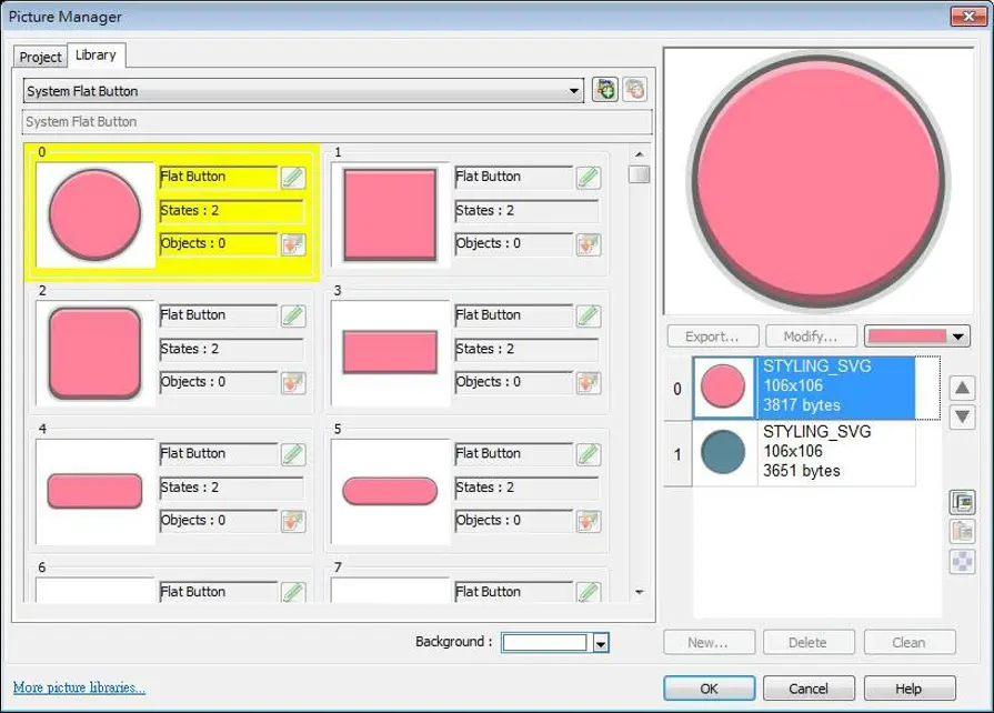
| Setting | Description |
|---|---|
| Picture Library | Click [Picture Library] button in Picture group box to open Picture Manager window. |
| Set to original dimensions | When this checkbox is selected, EasyBuilder will return the picture to its original size to eliminate the redrawing step. |
| Duplicate these attributes to every state | This button is available only when a system picture is used. Clicking this button will duplicate the attributes of the current picture to other states. |
Shape
Select [Use shape] and then click [Shape Library] button to open Shape Manager window and select a shape from the window.
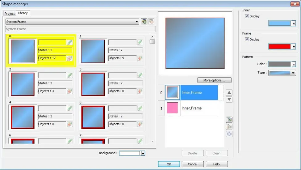
| Setting | Description |
|---|---|
| Inner | Select [Display] to show the inner color of the shape and select a color as the inner color by clicking the drop-down button.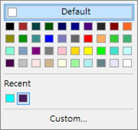 |
| Frame | Select [Display] to show the frame color of the shape and select a color as the frame color by clicking the drop-down button. |
| Pattern color | Click the drop-down button to select a color for the interior pattern of the shape. |
| Pattern type | Click the drop-down button to select a pattern.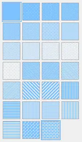 |
| Set to all states | Duplicate the attributes of the current state to other states. |
Shape Manager
In Picture Manager and Shape Manager windows, the currently selected picture / shape is highlighted yellow as shown below.
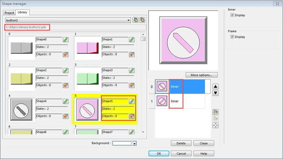
The information about the selected picture / shape above:
- Directory
- The directory from which EasyBuilder searches for the pictures / shapes.
- Shape5
- Name of the shape.
- States: 2
- Number of states of the shape.
- Objects: 0
- This shape is used by 0 object in the project.
- Inner
- The state 0 and state 1 of this shape contain only “inner” but not “frame.”
For more information about inner and frame, refer to the Shape Library and Picture Library pages.
Setting Label Text
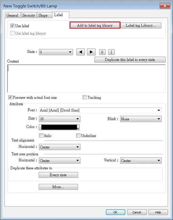
| Setting | Description |
|---|---|
| Use label | Use a label for the object. Add to Label Library Add a new label containing the content for all states to the Label Library. |
| Use label library | Use a label from the Label Library. |
| Label Library | View all the labels in the Label Library. For more information, see Label Tag Library and Multi Language Support page. |
| Content | Set the content of the label. If [Use label library] is selected, the content in the Label Library can be used. |
| Duplicate this label to every state | Copy the content of the current state to all states. |
| Tracking | With this option selected, changing the position of the text in one state will also change the text position in other states. |
| Font | Select a font from the list. EasyBuilder Pro supports Windows True-type fonts. |
| Size | Select a font size. |
| Color | Select a font color. |
| Blink | Specify the way the text blinks. Choose [None] to disable this feature or set the blinking interval to [1 second] or [0.5 seconds]. |
| Italic | Use Italic font. |
| Underline | Use Underline font. |
| Text Alignment | Multiline text is aligned within the label outline. Below are the corresponding shortcut keys and alignment example.  [Left] 111 2222222 3333333333 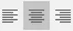 [Center] 111 2222222 3333333333  [Right] 111 22222222 3333333333 |
| Text area position | Multiline text is aligned within the object outline. Below are the corresponding shortcut keys. 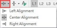 Horizontal Alignment 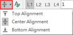 Vertical Alignment |
| Duplicate these attributes to every state | Copy the attributes of the current state to all states. |
| More | Convert labels to bitmap images (Use bitmap font) Convert the label text into bitmap format. This setting is only available for non-cMT models. ON = OFF (use state 0) The content displayed will not change due to state. Movement: Direction Set the direction of the marquee effect. The directions include: [No movement], [Left], [Right], [Up], [Down]. Continuous Specify how the marquee effect is displayed. If this option is not selected, the next text appears only when the previous text disappears completely If this option is selected, the text will be displayed continuously. Speed |
Note:
- When Text/Comment object is used with Comment enabled, the text used as comment will not appear on HMI.
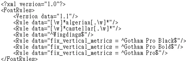
- When the texts of the fonts used in the editing window and on the HMI screen are not properly aligned vertically, it is possible to correct it with the FontRules.xml file in“%appdata%\Weintek\EasyBuilder” folder.
- By adding the names of the fonts in question into the FontRules.xml file, their vertical metrics can be adjusted in advance to avoid the misalignment problem.
Adjusting Profile Size
When an object is created and placed in the editing screen, double click it and select the [Profile] tab to adjust the position and size of the object.
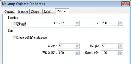
| Setting | Description |
|---|---|
| Position | Pinned When this check box is selected, the position and the size of the object cannot be changed. [X] and [Y] The coordinates of the position of the object in the editing screen. |
| Size | Adjust the [width] and [height] of the object. |
Overlapping Objects (cMT / cMT X Series)
The following explains the ways to find the overlapping objects and convert them into a single Combo Button. After conversion, the general settings of the Combo Button will follow the settings of the frontmost object.
Enable Touch Area
- Open View tab and select [Touch Area].

- All the touchable objects in the project will be highlighted in yellow, the overlapping areas will be highlighted in pink, and the objects that are not touchable will remain the same.
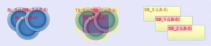
Find Overlapping Objects
- Open Tool tab and click [Find Overlapping Objects] to find all the touchable overlapping objects in the project.

- At the first time clicking [Find Overlapping Objects], the system will find the first group of overlapping objects in the current window. To search for the next group, click this button again. When all the overlapping objects in the current window are found, the system will start searching for overlapping objects in the next window, and then open the window in which overlapping objects are found.
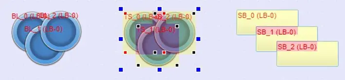
Note
- All layers of a window must be editable before clicking [Find Overlapping Objects].
Convert to Combo Button
When the overlapping objects found are Set Bit, Toggle Switch, Set Word, Multi-State Switch and Function Key, they can be converted to a single Combo Button by the following ways.
Method 1: Open Tool tab and click [Convert to Combo Button].
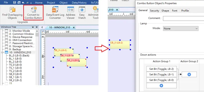
Method 2: Select the overlapping objects together, click the right mouse button, and then select [Conver to Combo Button].
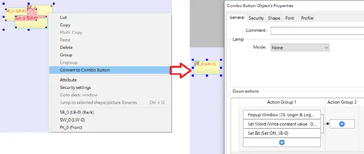
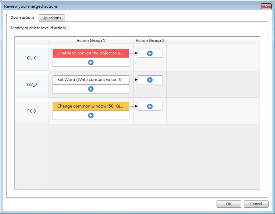
After [Convert to Combo Button] is clicked, a review window shows for users to review the actions that can be triggered by the Combo Button. Actions that are not highlighted can be merged; actions that are highlighted in yellow will be automatically adjusted to meet merging condition; and actions that are highlighted in red cannot be merged. The user can move the mouse cursor to the yellow or red area to see explanations.
Note
- The Comment of the generated Combo Button will follow the setting of the frontmost object that has a Comment.
- The Security settings of the generated Combo Button will follow the settings of the frontmost object. If the Security settings of the objects layers down are different from the frontmost object, an alert is shown after conversion.
- The Sound settings of the generated Combo Button will follow the settings of the frontmost object that has Sound settings. If the Sound settings of the objects layers down are different from the frontmost object, an alert is shown after conversion.
- The Picture or Shape, and the Label settings of the generated Combo Button will follow the settings of the frontmost object that has these settings. When there’s no object using a picture or a shape, the Combo Button will follow the Label settings of the backmost object that is mergeable.
- The generated Combo Button will have the Vibration setting enabled if any of the overlapping objects has Vibration setting enabled.
- The generated Combo Button will follow the Operation Log settings of the overlapping object that uses Operation Log. When Operation Log is used for multiple overlapping objects, an alert is shown after conversion.