

Dynamic Scale
Overview
Dynamic Scale offers customizable tick marks and scale labels and can be used together with objects such as Trend Display, Bar Graph…, etc.
Configuration
Click the Dynamic Scale icon on the toolbar to open a Dynamic Scale object property dialog box. Set up the properties, press OK button, and a new Dynamic Scale object will be created.
General Tab
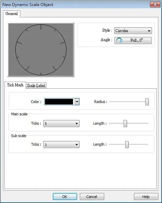
| Setting | Description |
|---|---|
| Style | Select the style from [Circular], [Horizontal], or [Vertical]. If select [Circular], set the [Direction] and [Degree].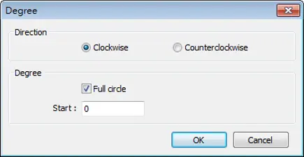 Direction Select from [Clockwise] or [Counterclockwise]. Degree If [Full circle] is selected, set the start degree. If [Full circle] is not selected, set the start and end degree. ![Start and End degrees are set manually when [full circle] option is not enabled](https://media.maplesystems.com/wp-content/uploads/2026/06/full-circle-option.webp) |
| Tick Mark | Select the color of the tick mark, and set the number of ticks for the main and sub scale (major and minor tick mark).For [Circular] style, the length of the major and minor tick mark, and the radius of the circular tick mark can be set. |
| Scale Label | Displays major tick labels. Circular 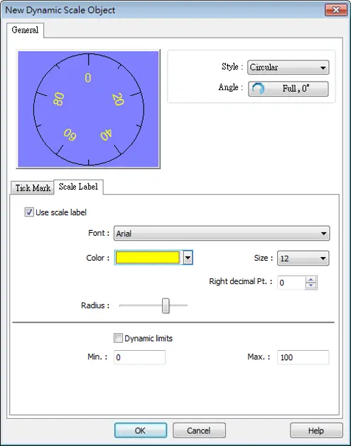 Set the font, font color, font size, and decimal point of the scale label. Set the radius start from the center of the object to the position to place the scale label. Vertical / Horizontal 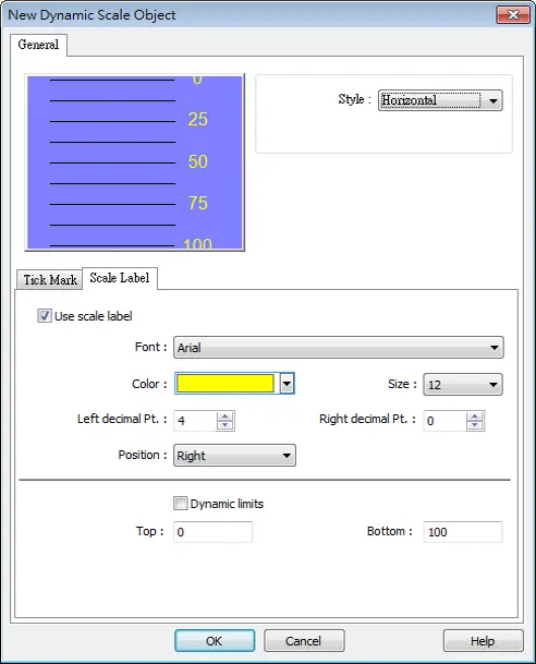 Set the font, font color, font size, and decimal point of the scale label.Set the position to display the scale label. The Max. and Min. limits of the scale label can be specified. If [Dynamic limits] is selected, the Max. and Min. limits can be set by the designated word addresses. 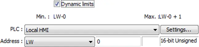 |

Dynamic Drawing
Overview
Dynamic Drawing object enables drawing a shape in a specified region on HMI screen at run time. The shape can be a line, a rectangle, a circle, or a dot. By setting the Attributes Addresses, the style and the color of the shape can be customized.
Configuration
Click the Dynamic Drawing icon on the toolbar to open a Dynamic Drawing object property dialog box. Set up the properties, press OK button, and a new Dynamic Drawing object will be created.
General Tab
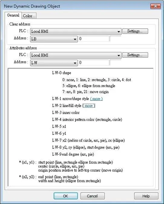
| Setting | Description |
|---|---|
| Clear Address | Clears the drawing. |
| Attributes Address | Changes the attribute in the drawing. |
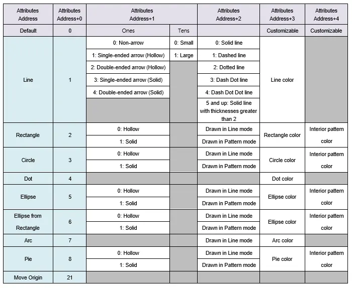
Entering different values in different Attributes Addresses brings different effects, as shown in the following table.
| Attributes Address | Attributes Address+0 | Attributes Address+1 | Attributes Address+2 | Attributes Address+3 | Attributes Address+4 | |
| Default | 0 | Ones | Tens | Customizable | Customizable | |
| Line | 1 | 0: Non-arrow | 0: Small | 0: Solid line | ||
| 1: Single-ended arrow (Hollow) | 1: Large | 1: Dashed line | ||||
| 2: Double-ended arrow (Hollow) | 2: Dotted line | Line color | ||||
| 3: Single-ended arrow (Solid) | 3: Dash Dot line | |||||
| 4: Double-ended arrow (Solid) | 4: Dash Dot Dot line | |||||
| 5 and up: Solid line with thicknesses greater than 2 | ||||||
| Rectangle | 2 | 0: Hollow | Drawn in Line mode | Rectangle color | Interior pattern color | |
| 1: Solid | Drawn in Pattern mode | |||||
| Circle | 3 | 0: Hollow | Drawn in Line mode | Circle color | Interior pattern color | |
| 1: Solid | Drawn in Pattern mode | |||||
| Dot | 4 | Dot color | ||||
| Ellipse | 5 | 0: Hollow | Drawn in Line mode | Ellipse color | Interior pattern color | |
| 1: Solid | Drawn in Pattern mode | |||||
| Ellipse from Rectangle | 6 | 0: Hollow | Drawn in Line mode | Ellipse color | Interior pattern color | |
| 1: Solid | Drawn in Pattern mode | |||||
| Arc | 7 | Drawn in Line mode | Arc color | |||
| Pie | 8 | 0: Hollow | Drawn in Line mode | Pie color | Interior pattern color | |
| 1: Solid | Drawn in Pattern mode | |||||
| Move Origin | 21 | |||||
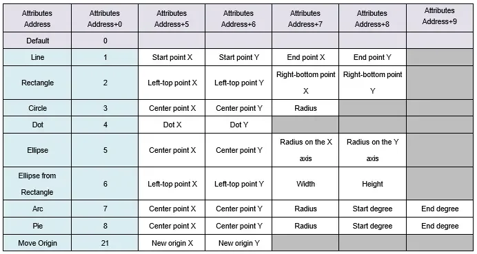
| Attributes Address | Attributes Address+0 | Attributes Address+5 | Attributes Address+6 | Attributes Address+7 | Attributes Address+8 | Attributes Address+9 |
|---|---|---|---|---|---|---|
| Default | 0 | |||||
| Line | 1 | Start point X | Start point Y | End point X | End point Y | |
| Rectangle | 2 | Left-top point X | Left-top point Y | Right-bottom point X | Right-bottom point Y | |
| Circle | 3 | Center point X | Center point Y | Radius | ||
| Dot | 4 | Dot X | Dot Y | |||
| Ellipse | 5 | Center point X | Center point Y | Radius on the X axis | Radius on the Y axis | |
| Ellipse from Rectangle | 6 | Left-top point X | Left-top point Y | Width | Height | |
| Arc | 7 | Center point X | Center point Y | Radius | Start degree | End degree |
| Pie | 8 | Center point X | Center point Y | Radius | Start degree | End degree |
| Move Origin | 21 | New origin X | New origin Y |
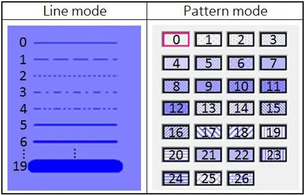
The values in [Attributes Address+2] represent different Line or Pattern styles, as shown in the following table.
Color Tab
| Setting | Description |
|---|---|
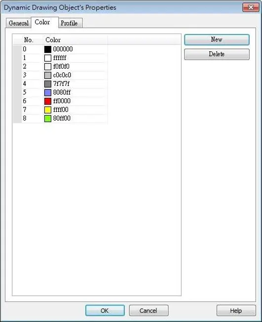
| New | Adds a color to be used in the drawing. |
| Delete | Deletes the selected color. |
Example
How to dynamically draw an arrow or circle on the HMI screen
Follow these steps to build the project.
Instructions: How to dynamically draw an arrow or circle on the HMI screen
Create a Dynamic Drawing object
Create a Dynamic Drawing object, set Clear Address to LB-0, and Attributes Address to LW-0.Create a Toggle Switch Object
Create a Toggle Switch object, set address to LB-0, and select Toggle as switch style, for clearing the drawing.Create 10 Numeric Objects
Create 10 Numeric objects, set addresses to LW-0~LW-9, for specifying the attributes in the drawing.Run Project (Download or simulate)
Run simulation or download the project to HMI to see the result.
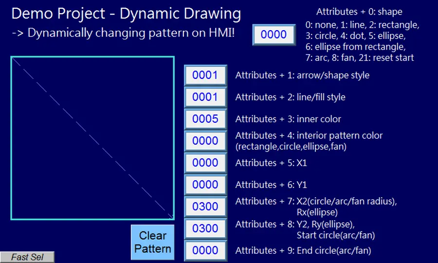
By entering 1 in LW-0, a line is drawn, and entering different values in LW-1~9 can change the style, the color, and the position of the line.
Clear pattern and change to a circle
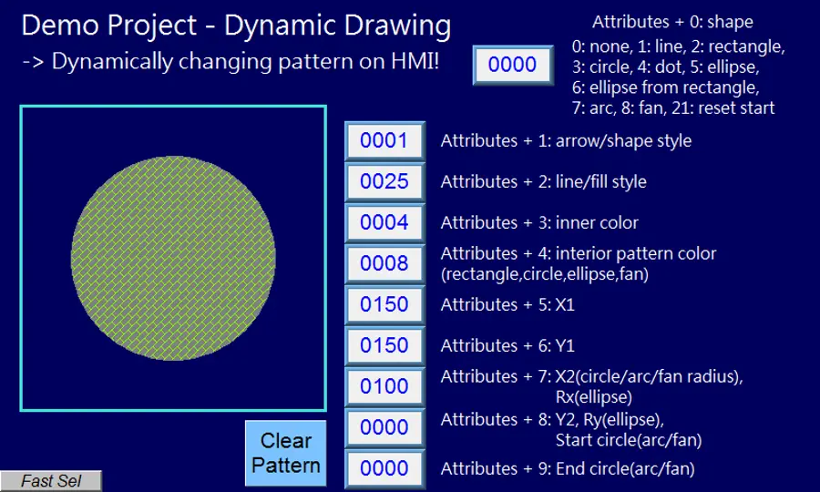
Press Clear Pattern button, and enter 3 in LW-0, a circle is drawn.
Entering different values in LW-1~9 can change the style, the color, and the position of the circle.
Notes:
- Before using Attributes Address, please define [Attributes Address + 1] ~ [Attributes Address + 9]. The system will reset the Attributes Address, after it is used.
- If the drawing is not cleared, the new drawing will overlap the previous one, and the maximum acceptable number of drawings in a Dynamic Drawing object is 1000.
- The maximum number of line styles is 19, which means the maximum thickness of a solid line is 16. The style numbers that exceed 19 will be displayed as 19.
- Find the color number in Color tab.
- The range of the start and end degree for Arc and Pie is 0 to 360 degrees.
- Origin position is relative to left-top corner (0,0). Giving “move origin” command will make (x1, y1) the new origin, and x1, y1 will keep on accumulating until being reset to (0,0) by clearing the drawing.
- If cMT Viewer is used to monitor a Dynamic Drawing object on a cMT / cMT X model, then PLW address is recommended to be used as the Attribute Address, so that drawing commands can be given to the cMT Viewer device’s PLW addresses. This prevents the issue where the HMI and the cMT Viewer device show different drawing results.

Pie Chart
Overview
The Pie Chart object draws a pie chart that is divided into slices to illustrate numerical proportion, according to the value of the designated read address.
Configuration
Click the Pie Chart icon on the toolbar to open the property dialog box. Set up the properties, press OK button, and a new Pie Chart object will be created.
General Tab
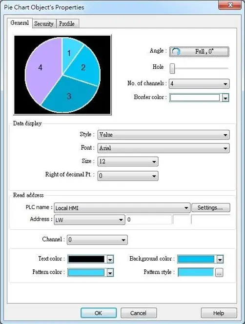
| Setting | Description |
|---|---|
| Angle | Set the [Start degree] of the chart. Choose the Chart to be [Clockwise] or [Counter clockwise]. If [Full circle] isn’t selected, then [End degree] must be set. |
| Hole | Set the size of the hollow circle in the center of Pie Chart.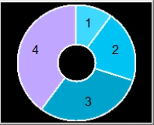 |
| No. of channels | Set the number of channels to be displayed in the chart. The range is from 2 to 16. |
| Border color | Set the color of the border. |
| Data display | The [Style] can be set as [None], [Value] and [Percentage]. The [Font] and [Size] are for the text on the chart. For Value Style, the [Right of decimal Pt.] can set the value on the chart to be displayed with the decimal point. The [Right of decimal Pt.] option is only available for [Value] style. |
| Read Address | The address is for channel 1. The following consecutive addresses are for the rest of the channels. For example, if the Read Address is LW-0, then the Read Address for channel 2 is LW-1; channel 3 is LW-2…and so on. |
| Channel | Set the [Text color], [Background color], [Pattern color], and [Pattern style] of the selected channel. The [Background color] is for the [Pattern style] that has background. If the [Pattern style] doesn’t have a background, then the [Background color] doesn’t need to be set. |
Combo Setting
cMT / cMT X Series HMI support combo setting for Pie Chart, which allows setting of multiple related objects at a time. Pie chart can be set with Background and Legend.
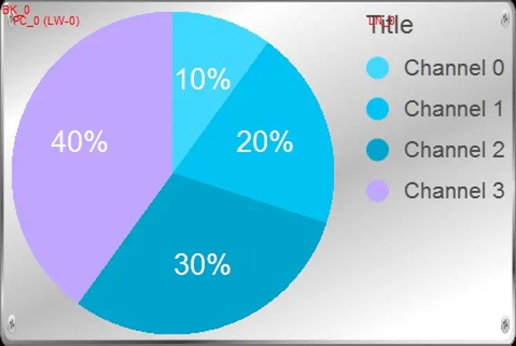
Background
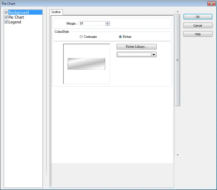
| Setting | Description |
|---|---|
| Margin | Specify the space between the background edge and the objects. |
| Color/Style | Customize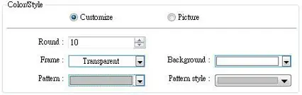 Select a suitable background pattern and color. Picture 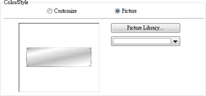 Use the default picture or choose a picture from Picture Library. |
Legend
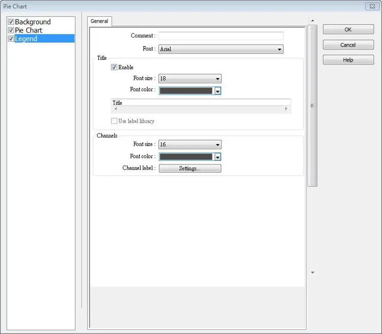
| Setting | Description |
|---|---|
| Title | Set whether to use a title for Pic Chart, and set the font size / font color of the title. The title can be selected from Label Library. |
| Channel | Set the channel label. When using Label Library, the number of the channels should be the same as the number of states in the library. |

Flow Block
Overview
Flow Block object displays the flow status of the blocks in the pipe or the status of the transportation lines. Unlike Moving Shape object which requires a precise measurement between two points when drawing a straight line provided by users, the blocks flow at a fixed interval in a horizontal or vertical straight line.
For cMT / cMT X Series models, drawing non-horizontal and non-vertical lines is possible.
Flow Block features:
- Each section of the Flow Block must be a horizontal or vertical straight line and the blocks flow at a fixed interval within it. For cMT / cMT X Series models, drawing non-horizontal and non-vertical lines is possible (angle limit: 5 degrees).
- Dynamic speed and direction adjustment (Speed and direction can be controlled by a designated register).
- Security mechanism (Interlock), which hides Flow Block when the status of designated bit is invalid.
Configuration
Click on the Flow Block icon on the toolbar or select [Objects] » [Animation] » [Flow Block] to create object.
General Tab
| Setting | Description |
|---|---|
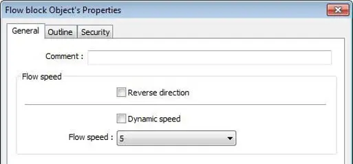
| Reverse direction | The blocks flow in the direction the object is drawn (the blue arrow). If select this check box, the blocks flow in the opposite direction.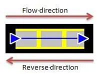 |
| Dynamic speed | Read address The direction and speed at which the blocks flow can be controlled by a designated register. The valid range is -25 to 25. When a negative value is entered, the blocks flow in a reversed direction. Setting Displays the address and format of the designated register. [System register], [Index register], and [Tag Library] can be set here. |
| Flow speed | 25 flow speed levels, the valid range is 0 to 25 when [Dynamic speed] is not selected. A larger value indicates a faster speed. |
Outline Tab
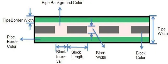
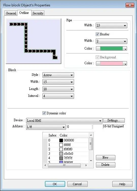
For setting the outline property of Flow Block. The following illustration shows each item.
| Setting | Description |
|---|---|
| Pipe | Sets the properties of the pipe within which the blocks flow. The background color, border width and color can be set. When the [Border] check box is selected, the background color must be set. |
| Block | Sets the properties of blocks. Style, width, length, interval and color can be set. Available styles are Rectangle and Arrow. The direction in which the arrows point indicates the direction of the flow block. Rectangle: ▮▮▮ Arrow: ►►► |
| Dynamic color | Allows dynamic color change with 256 customized colors, numbered from 0 to 255 allowed. The color is selected by entering a value in the designated register. Entering a value greater than the largest color number changes the Flow Block to the last color in the list. |
Notes:
- If both [Reverse direction] and [Dynamic speed] check boxes are selected in [General] tab, when entering a negative value in the designated register of dynamic speed, the blocks flow in the direction the object is drawn.
- When both [Arrow] and [Dynamic speed] are selected, the arrow will only show when a value is given to the designated address.
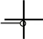
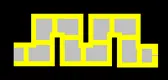
- To avoid the pipe lines from overlapping when drawing a turn, there is a minimum width planned at each turn. As shown in the left image below, the sign on the cross cursor defines the minimum width. The right image below demonstrates that each turn is drawn in the minimum width.
- The valid range of the length, width, and height of the Flow Block can be adjusted according to the size of the object drawn and the size of the window.
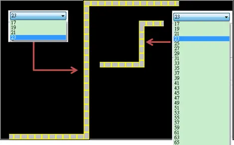
- As shown in the following figure, when the size of the Flow Block is larger, the valid range is restricted to prevent the flow block from exceeding the window size. When the size of the object is smaller, the adjustment range will be larger.
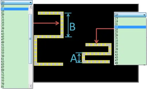
- To prevent the flow block from overlapping itself, when the distance between two lines is shorter (Section A), the valid range is restricted. When the distance is longer (Section B), the adjustment range will be larger.
Example
How to use Dynamic Speed to control the Flow Block
Follow these steps to control the speed and direction of flow block by an external word register.
Instructions: How to use Dynamic Speed to control the Flow Block
Create and configure Flow Block Object
Create a Flow Block object and select [Dynamic speed] check box.
Set [Address] to LW-0, and set the format to 16-bit Signed.
If you want to change the direction, select the “Reverse Direction” check box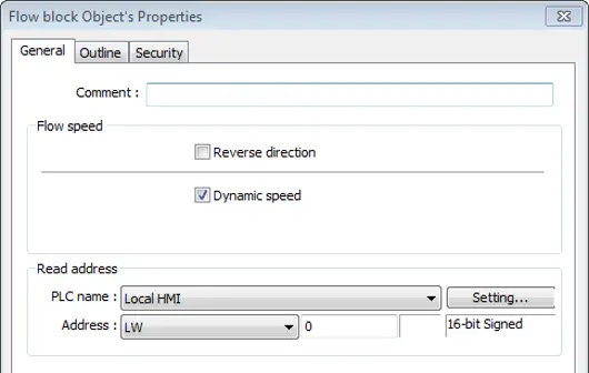
Create a Numeric Object
Create a Numeric object, set [Address] to LW-0.
The high limit is 25, and the low limit is -25. The format is 16-bit Signed.
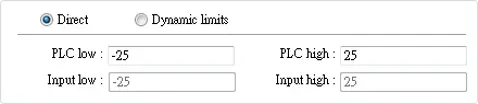
Download or Simulate.
Execute simulation or download the project to HMI.
When entering a positive value in LW-0, the blocks flow in the direction the section is drawn. A larger value indicates a faster speed.
When a negative value is entered, the blocks flow in a reversed direction, and the smaller value indicates a faster speed.
When 0 is entered, it stops flowing.

Table Object
Overview
Table object allows users to draw a table in the project window and customize the border, grid, and pattern of the table.
Configuration
Click the Table icon on the toolbar to create a Table object. Or, click [Object] » [Table] in the menu.
General Tab
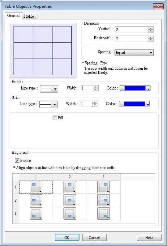
| Setting | Description |
|---|---|
| Preview Window | Displays the settings result. |
| Vertical | Sets the number of columns in the table. Range: 1~255. |
| Horizontal | Sets the number of rows in the table. Range: 1~255. |
| Spacing | The available options are [Equal] and [Free]. When [Free] is selected, the user can manually adjust the column width or row height in the editing window. |
| Border | Sets the type, width, and color of the border. [Line width] setting is available only when Solid line type is selected. The range of width is 0~8. The line will become invisible when the width is set to 0. |
| Grid | Sets the type, width, and color of the grid. [Line width] setting is available only when Solid line type is selected. The range of width is 0~8. The line will become invisible when the width is set to 0. |
| Fill | Sets the pattern style and color. |
| Alignment | By dragging the objects into the cells in the Table, the objects can align to the preset position. Different alignments can be set for each cell in the Table, by default the objects are center-aligned, and nine different alignments can be selected as shown in the screenshot of the settings window. With Alignment enabled, the maximum number of vertical / horizontal divisions is 32. Please note that this setting does not support the alignment of multiple groups of objects. |

String Table
Overview
By pre-configuring the texts and their corresponding numbers in the String Table, the text can be changed dynamically on HMI. String Table can also be used in a multi-language environment.
Configuration
Click [Project] » [String] to open the property dialog box. Set up the properties, press OK button, and a new String Table object will be created.
Settings
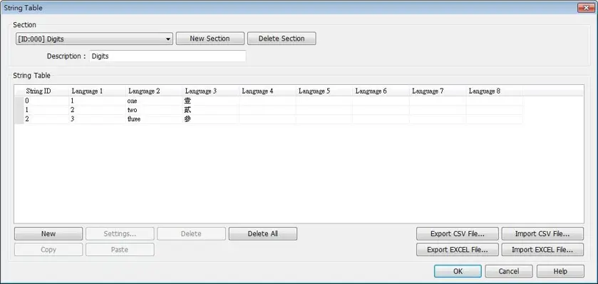
| Setting | Description |
|---|---|
| Section | A list of all the existing String Tables. [New Section] Add a new String Table. [Delete Section] Delete the selected String Table. |
| New | Add a new string in the table. |
| Settings | Set the content of the selected string. |
| Export CSV File… | Export all the existing String Tables as a *.csv file. |
| Import CSV File… | Import *.csv file into the String Table. |
| Export EXCEL File… | Export all the existing String Tables as a *.xls file. |
| Import EXCEL File… | Import *.xls file into the String Table. |
Notes:
- The font of each language in the String Table must be specified in Label Text Library.
- Number of rows from all sections combined is limited to 10000.
Example
How to Create a String Table and change the Displayed Text String
Follow these steps to create a string table and change the text.
Create String Table as above
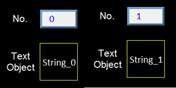
Create a String Table using the same settings as the preceding figure.Create Text Object and reference the string table
Create a Text object, select [Use string table] check box. In String ID group box, select [Dynamic] and set read address to LW-0.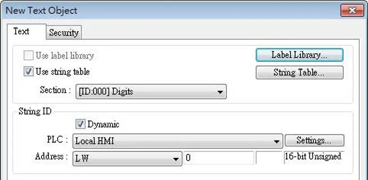
Create Numeric Object
Create a Numeric object, set address to LW-0.Simulate or Download
When the value in LW-0 is 0, the No. 0 string is displayed.
When the value in LW-0 is 1, the No. 1 string is displayed.
Barcode Display Object

1D Barcode Display
Overview
The 1D Barcode Display object generates a corresponding barcode in the window using the data entered into the specified word address, intended for scanning purposes.
Configuration
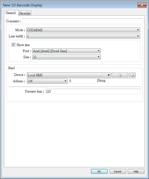
Click the 1D Barcode Display icon on the toolbar to open the property dialog box. Set up the properties, press OK button, and a new 1D Barcode Display object will be created.
General Tab
| Setting | Description |
|---|---|
| Mode | Supports CODABAR, CODE 39, CODE 93, CODE 128, EAN 8, EAN 13. |
| Line width | Set the line width of the 1D barcode. |
| Show text | Set whether to display corresponding text below the 1D barcode. Font Set the font for the displayed text. Size Set the font size for the displayed text. |
| Read address | The 1D Barcode Display object will display the barcode generated from the data entered into the specified word address. The word length limit: 1 ~ 80. |
| Preview data | This data preview will be converted into a barcode, aiding in the design and preview of the project screen. |

2D Barcode Display
Overview
The 2D Barcode Display object transfers the information from the read address into QR Code or Aztec Code.
Configuration
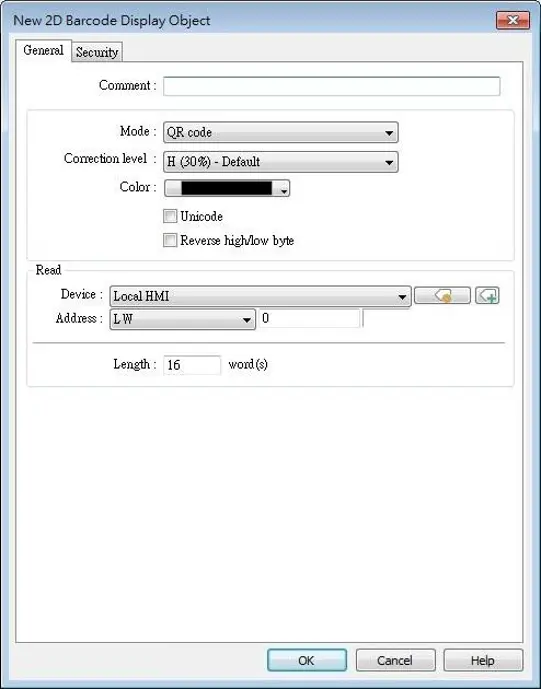
Click the 2D Barcode Display icon on the toolbar to open the property dialog box. Set up the properties, press OK button, and a new 2D Barcode Display object will be created.
General Tab
| Setting | Description |
|---|---|
| Mode | Supports QR code, Aztec code, and Data Matrix. |
| Correction level | 2D barcodes have error correction capability to restore data if the barcode is dirty or damaged. QR code Four correction levels are available: L, M, Q, and H. The data restoration rate is listed below. (The data restoration rate for total codewords. Codeword is a unit that constructs the data area.) • L — 7% • M — 15% • Q — 25% • H — 30% Aztec code Aztec code supports error correction levels from 5% to 95%. Specifying a higher correction value results in a larger printed symbol and increases accuracy. |
| Color | Set the 2D barcode color. |
| UNICODE | By default, the 2D barcode is generated via ASCII encoding. If this check box is selected, the 2D barcode is generated via UNICODE encoding. For characters that are not ASCII defined English alphabets or numbers, for example, Chinese or Korean characters, please select the Unicode check box. |
| Reverse high/low byte | By default, the 2D barcode is displayed in high byte then low byte order. With this option selected, the 2D barcode is displayed in a reversed order, low byte then high byte. |
| Read address | The 2D Barcode Display object will display the 2D barcode generated from the information entered by the read address. The word length limit of QR code: 1 ~ 1024. The word length limit of Aztec code and Data Matrix: 1 ~ 2048. |

Push Notification Barcode Display
Overview
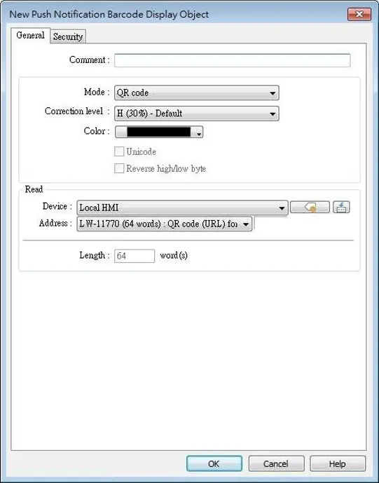
Push Notification Barcode Display object displays the QR code needed for setting up EasyAccess 2.0 push notification via messaging applications.
Configuration
Click the [Object] » [Barcodes] » [Push Notification Barcode Display] to open the property dialog box. Set up the properties, press OK button, and a new Push Notification Barcode Display object will be created.
General Tab
| Setting | Description |
|---|---|
| Mode | Supports QR code, Aztec code, and Data Matrix. |
| Correction level | 2D barcodes have error correction capability to restore data if the barcode is dirty or damaged. QR code Four correction levels are available: L, M, Q, and H. The data restoration rate is listed below. (The data restoration rate for total codewords. Codeword is a unit that constructs the data area.) • L — 7% • M — 15% • Q — 25% • H — 30% Aztec code Aztec code supports error correction levels from 5% to 95%. Specifying a higher correction value results in a larger printed symbol and increases accuracy. |
| Color | Set the 2D barcode color. |
| UNICODE | Cannot be changed by default. |
| Reverse high/low byte | Cannot be changed by default. |
| Read address | Cannot be changed by default. |
System Parameters Menu Settings
| Setting | Description |
|---|---|
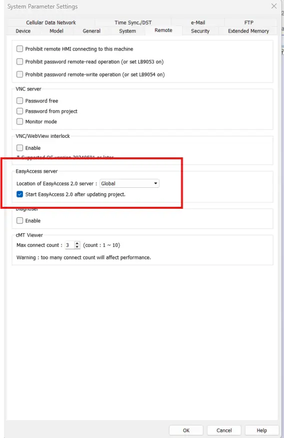
| EasyAccess Server | Global: Supports push notification features of WeChat, Facebook, and Line. China: Supports push notification features of WeChat only. |
Note:
- EasyAccess Server for all Maple Systems products should be set as Global.
Push Notification Settings
After downloading the project file to HMI, the QR code will be shown on HMI screen.

Calendar Object (cMT / cMT X Series)
Overview
The Calendar object can show a calendar on cMT / cMT X Series HMI.
Configuration
Click [Object] » [Time-related] » [Calendar] icon on the toolbar to open a Calendar object property dialog box. Set up the properties, press OK button, and a new Calendar object will be created.
Appearance Tab
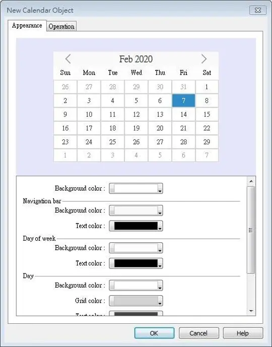
| Setting | Description |
|---|---|
| Appearance | Navigation bar Set the background color and text color of the navigation bar. Day of week Set the background color and text color of the days of week. Day Set the background color, grid color, and text color of the days. Today Set the background color and text color to show today. |
Operation Tab
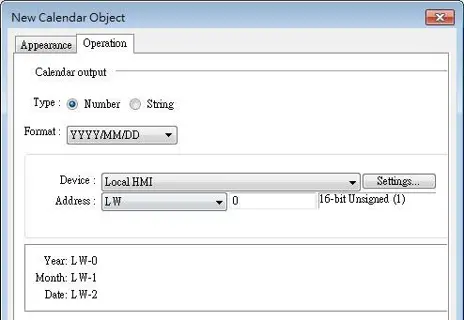
| Setting | Description |
|---|---|
| Operation | Output the date information in a number or a string to the designated address. |