
Screen Buttons
The MAPware software provides four button objects that change screens. When the operator presses one of these buttons, a new screen displays or a popup screen appears.

Go to Screen Object
Use to display a button on screen that, when pressed, displays a new screen.
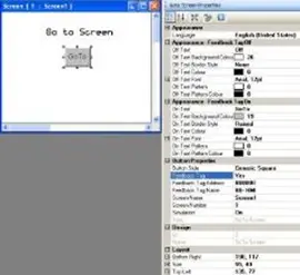
Place a Go to Screen button on screen
- Use one of the following:
- Click Draw > Buttons > Navigation Buttons > Go to Screen from the standard menu
- Click Quick Buttons > Go to Screen from the Draw toolbar
- Move cursor to a start point for the button object. Click and hold mouse cursor.
- Drag mouse cursor to an end point for the button object and release. The button appears on screen and the Go to Screen Properties box displays.
Go to Screen Properties Options
- Visibility Animation (description) – make the object disappear or become ‘invisible’.
- Language (description) – configure a text label for up to nine languages per object.
- Text Alignment (description) – Determines the alignment of the text in relation to the size of the button.
- Transparency – Sets the object as transparent or not.
- Appearance Feedback Tag On/Off (description) – select the On and/or Off labels.
- On/Off Text – entry field for the text that is to appear on the button.
- On/Off Text Background Color – fill color of the button.
- On/Off Text Border Style – Selecting a general border style for the button.
- On/Off Text Color – this is the color of the text. Click to display the color palette.
- On/Off Text Font – these are the particular font size settings for the TrueType font selected.
- On/Off Text Pattern – option to have a two-color pattern for the background.
- On/Off Text Pattern Color – select the secondary color for the patterned background.
- Gradient (HMC4000 only) (description) – Allows you to make the background color a gradient of two colors
- Button Style (description) – selects a style or ‘look’ to the button.
- Enable Control Bit (description) – Enables and disables the Control bit for the button.
- Feedback Tag (description) – Enable this feature and select the same tag for both the target address and the feedback tag address, if you wish to see the button change state (i.e. go from an ‘off’ or untouched look to an ‘on’ or touched look).
- Simulation – select ‘On/Off’ to see how button looks in that state (only available if Feedback Tag is set to ‘Yes’).
- Screen Name – select from the pull-down list box, the screen that you wish to display when the button is pressed.
- Screen Number – this is the number assigned to the selected screen.
- Task – Go to Screen (cannot be modified)
- Design (description) – identifies object.
- Layout (description) – coordinates (i.e. size and position) for the object.
Resize a Go to Screen button
Move the mouse pointer over one of the resize handles. When the pointer changes to a double-headed arrow, simply click and drag to a new location.

Go to Next Screen Object
Use to display a button on screen that, when pressed, displays the next screen in numerical sequence. If there are no higher screens, then pressing this button has no effect.
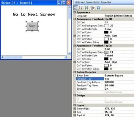
Place a Go to Next Screen button on screen
- Use one of the following:
- Click Draw > Buttons > Navigation Buttons > Go to Next Screen from the standard menu
- Click Quick Buttons > Go to Next Screen from the Draw toolbar
- Move cursor to a start point for the button object. Click and hold mouse cursor.
- Drag mouse cursor to an end point for the button object and release. The button appears on screen and the Go to Next Screen Properties box displays.
Go to Next Screen Properties Options
- Visibility Animation (description) – make the object disappear or become ‘invisible’.
- Language (description) – configure a text label for up to nine languages per object.
- Text Alignment (description) – Determines the alignment of the text in relation to the size of the button.
- Transparency – Sets the object as transparent or not.
- Appearance Feedback Tag On/Off (description) – select the On and/or Off labels
- On/Off Text – entry field for the text that is to appear on the button.
- On/Off Text Background Color – fill color of the button.
- On/Off Text Border Style – Selecting a general border style for the button.
- On/Off Text Color – this is the color of the text. Click to display the color palette.
- On/Off Text Font – these are the particular font size settings for the TrueType font selected.
- On/Off Text Pattern – option to have a two-color pattern for the background.
- On/Off Text Pattern Color – select the secondary color for the patterned background.
- Gradient (HMC4000 only) (description) – Allows you to make the background color a gradient of two colors
- Button Style (description) – selects a style or ‘look’ to the button.
- Enable Control Bit (description) – Enables and disables the Control bit for the button.
- Feedback Tag (description) – Enable this feature and select the same tag for both the target address and the feedback tag address, if you wish to see the button change state (i.e. go from an ‘off’ or untouched look to an ‘on’ or touched look).
- Simulation – select ‘On/Off’ to see how button looks in that state (only available if Feedback Tag is set to ‘Yes’).
- Task – Go to Next Screen (cannot be modified)
- Design (description) – identifies object.
- Layout (description) – coordinates (i.e. size and position) for the object.
Resize a Go to Next Screen button
Move the mouse pointer over one of the resize handles. When the pointer changes to a double-headed arrow, simply click and drag to a new location.

Go to Previous Screen Object
Use to display a button on screen that, when pressed, displays the prior screen in numerical sequence. If there are no lower screens, then pressing this button has no effect.
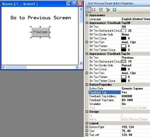
Place a Go to Previous Screen button on screen
- Use one of the following:
- Click Draw > Buttons > Navigation Buttons > Go to Previous Screen from the standard menu
- Click Quick Buttons > Go to Previous Screen from the Draw toolbar
- Move cursor to a start point for the button object. Click and hold mouse cursor.
- Drag mouse cursor to an end point for the button object and release. The button appears on screen and the Go to Previous Screen Properties box displays.
Go to Previous Screen Properties Options
- Visibility Animation (description) – make the object disappear or become ‘invisible’.
- Language (description) – configure a text label for up to nine languages per object.
- Text Alignment (description) – Determines the alignment of the text in relation to the size of the button.
- Transparency – Sets the object as transparent or not.
- Appearance Feedback Tag On/Off (description) – select the On and/or Off labels
- On/Off Text – entry field for the text that is to appear on the button.
- On/Off Text Background Color – fill color of the button.
- On/Off Text Border Style – Selecting a general border style for the button.
- On/Off Text Color – this is the color of the text. Click to display the color palette.
- On/Off Text Font – these are the particular font size settings for the TrueType font selected.
- On/Off Text Pattern – option to have a two-color pattern for the background.
- On/Off Text Pattern Color – select the secondary color for the patterned background.
- Gradient (HMC4000 only) (description) – Allows you to make the background color a gradient of two colors
- Button Style (description) – selects a style or ‘look’ to the button.
- Enable Control Bit (description) – Enables and disables the Control bit for the button.
- Feedback Tag (description) – Enable this feature and select the same tag for both the target address and the feedback tag address, if you wish to see the button change state (i.e. go from an ‘off’ or untouched look to an ‘on’ or touched look).
- Simulation – select ‘On/Off’ to see how button looks in that state (only available if Feedback Tag is set to ‘Yes’).
- Task – Go to Previous Screen (cannot be modified)
- Design (description) – identifies object.
- Layout (description) – coordinates (i.e. size and position) for the object.
Resize a Go to Previous Screen button
Move the mouse pointer over one of the resize handles. When the pointer changes to a double-headed arrow, simply click and drag to a new location.

Open Popup Screen Object (HMC2000 only)
Use to display a button on screen that, when pressed, displays a popup screen (a screen that is smaller than the size of the display). The Open Popup Screen button cannot be placed and used on popup screens.
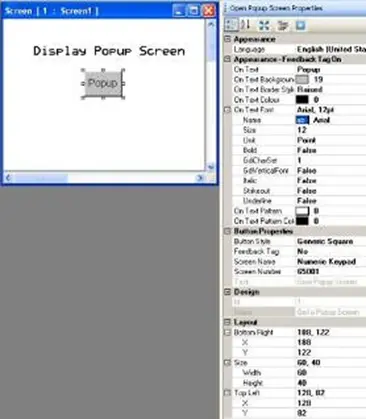
Place Open Popup Screen button on screen
- Use one of the following:
- Click Draw > Buttons > Navigation Buttons > Open Popup Screen from the standard menu
- Click Quick Buttons > Open Popup Screen from the Draw toolbar
- Move cursor to a start point for the button object. Click and hold mouse cursor.
- Drag mouse cursor to an end point for the button object and release. The button appears on screen and the Open Popup Screen Properties box displays.
Open Popup Screen Properties Options
- Visibility Animation (description) – make the object disappear or become ‘invisible’.
- Language (description) – configure a text label for up to nine languages per object.
- Text Alignment (description) – Determines the alignment of the text in relation to the size of the button.
- Transparency – Sets the object as transparent or not.
- Appearance Feedback Tag On/Off (description) – select the On and/or Off labels.
- On/Off Text – entry field for the text that is to appear on the button.
- On/Off Text Background Color – fill color of the button.
- On/Off Text Border Style – Selecting a general border style for the button.
- On/Off Text Color – this is the color of the text. Click to display the color palette.
- On/Off Text Font – these are the particular font size settings for the TrueType font selected.
- On/Off Text Pattern – option to have a two-color pattern for the background.
- On/Off Text Pattern Color – select the secondary color for the patterned background.
- Button Style (description) – selects a style or ‘look’ to the button.
- Enable Control Bit (description) – Enables and disables the Control bit for the button.
- Feedback Tag (description) – Enable this feature and select the same tag for both the target address and the feedback tag address, if you wish to see the button change state (i.e. go from an ‘off’ or untouched look to an ‘on’ or touched look).
- Simulation – select ‘On/Off’ to see how button looks in that state (only available if Feedback Tag is set to ‘Yes’).
- Screen Name – select from the pull-down list box, the popup screen that you wish to display when the button is pressed.
- Screen Number – this is the number assigned to the selected screen.
- Task – Go to Popup Screen (cannot be modified)
- Design (description) – identifies object.
- Layout (description) – coordinates (i.e. size and position) for the object.
Resize an Open Popup Screen button
Move the mouse pointer over one of the resize handles. When the pointer changes to a double-headed arrow, simply click and drag to a new location.
Opening a Popup Screen on an HMC4000
The “open popup screen” button was removed for the HMC4000s, but it’s been replaced with a more dynamic and flexible system. Under “Advanced Objects” select a multi task single state button and place it on any base screen. In the button properties, go to the tasks line and select it. For “Press Tasks” select the “Write Value to Tag” task then select the Popup_screen_number tag. Then in the number box, type in the number of the popup screen you wish to trigger, then click the Add button.
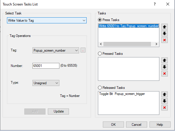
Next, select the “Released Tasks” then in the select tasks drop down choose the “Toggle Bit” option. Then select the Popup_screen_trigger tag and click the Add button. Click ok to close out of the screen tasks window.
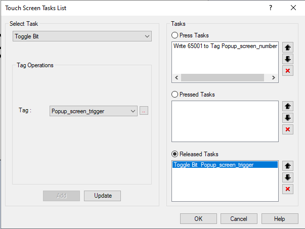
This Multi-Task button now not only serves as an “open popup screen” button, but you can use a “write value from tag B to tag A task instead and create a dynamic popup button. See the section on creating and using tasks for more information
Bit-based Objects
The MAPware software provides many options for displaying and writing to bit/coil registers. Bit/coil registers are two state registers that are used to represent an ‘On[1]’ and ‘Off[0]’ condition. Bit registers often display lamps or buttons that control a target bit.

Bit Lamp
Bit lamps indicate the current state of a bit register using a graphic image (i.e. lamp) or text (i.e. ON/OFF). When a bit lamp is on a screen that is currently displayed on the HMC, the HMC continuously polls the target bit register to determine which state image to display.
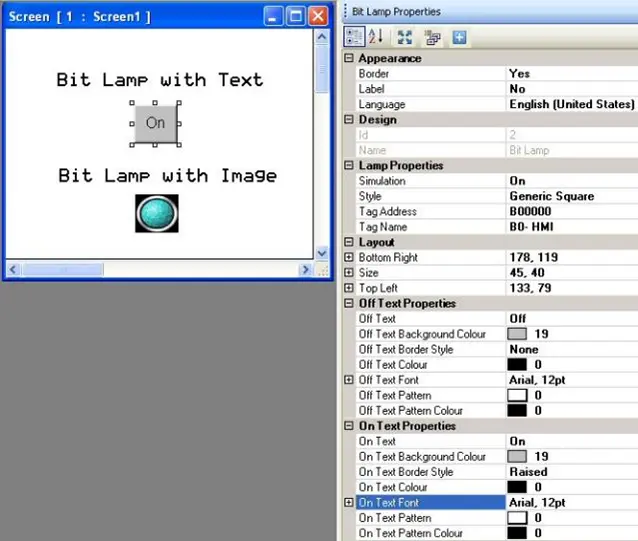
Place a Bit Lamp object on screen
- Use one of the following:
- Click Draw > Display Objects > Bit Lamp from the standard menu
- Click Advanced Objects > Bit Lamp from the Draw toolbar
- Click the Bit Lamp Display icon in the Objects toolbar.
- Move cursor to a start point for the object. Click and hold mouse cursor.
- Drag mouse cursor to an end point for the object and release. The object appears on screen and the Bit Lamp Properties box displays.
Bit Lamp Properties Options
- Visibility Animation (description) – make the object disappear or become ‘invisible’.
- Border (description) – add a line around the perimeter of the object.
- Label (description) (HMC2000 only) – option to have a label appear on the top/bottom of the object.
- Language (description) – configure a text label for up to nine languages per object.
- Text Alignment (description) – Determines the alignment of the text in relation to the size of the lamp.
- Transparency – Sets the object as transparent or not.
- Design (description) – identifies object.
- Gradient (description) (HMC4000 only) – Allows you to create a gradient for the background of the lamp
- Simulation – select ‘On/Off’ to see how button looks in that state (only available if Feedback Tag is set to ‘Yes’).
- Style (description) – select a style or ‘look’ to the lamp.
- Tag Name (description) – this is the tag of the target bit/coil that is monitored.
- Layout (description) – coordinates (i.e. size and position) for the object.
- On/Off Text Properties (description) – select the On and Off labels that appear when using the Generic Square, Circle, or Rounded Rectangle button style.
Resize a Bit Lamp object
Move the mouse pointer over one of the resize handles. When the pointer changes to a double-headed arrow, simply click and drag to a new location.

Bit Display
Bit Display indicates the current state of a bit register using two predefined messages (i.e. ON/OFF). The current value read in the targeted bit/coil message determines what message displays. Messages can be of varying length (maximum of 40 characters). When a bit data display is on an HMC screen, the HMC continuously polls the target bit register to determine which message to display.
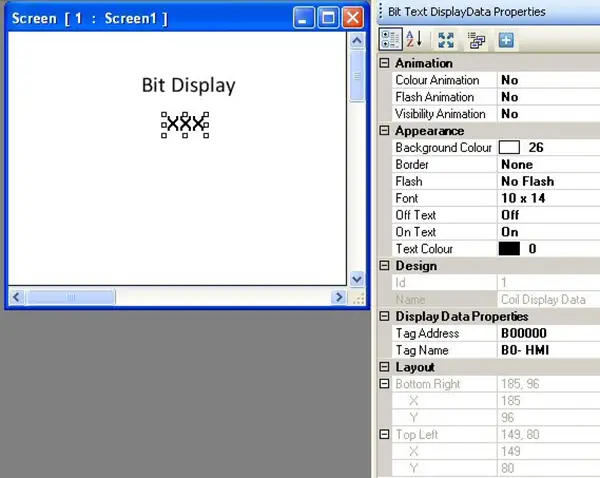
Place a Bit Display object on screen
- Use one of the following:
- Click Draw > Display Objects > Data Display > Bit Data from the standard menu
- Click Show Data > Bit Data from the Draw toolbar
- Click the Bit Display icon in the Objects toolbar.
- Move cursor to a start point for the button object. Click to place the object on screen.
- The object appears on screen and the Bit Text Display Data Properties box displays.
Bit Display Properties Options
- Color Animation (description) – dynamically change the color of the object.
- Flash Animation (description) – dynamically ‘flash’ object.
- Visibility Animation (description) – make the object disappear or become ‘invisible’.
- Background Color (description) – option to select a color as a ‘backdrop’ to the object.
- Border (description) – add a line around the perimeter of the object.
- Flash (description) – continuously ‘flashes’ the object.
- Font (description) – select from one of four options – 5×7, 7×14, 10×14, and 20×28 pixels.
- On/Off Text – message text displayed according to the current value in the target tag. Maximum number of characters is 40.
- Text Alignment (description) (HMC4000 only) – Determines the alignment of the text in relation to the size of the button.
- Text Color – Determines the color of the text. Click to display the color palette.
- Transparency – Sets the object as transparent or not.
- Design (description) – identifies object.
- Tag Name (description) – this is the tag of the target bit/coil that is monitored.
- Layout (description) – coordinates (i.e. size and position) for the object.
Resize a Bit Display object
The Bit Data object cannot resize (unless you change the Font attribute) but can move.

Set Bit
The Set Bit button sets a targeted bit/coil. The button displays with either text labels or a graphic image to represent two states. When a set bit button is on screen, the HMC continuously polls the target bit register to determine which state to display (feedback tag must be enabled to display two states).
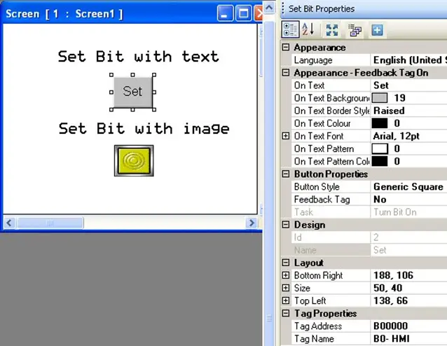
Place a Set Bit button object on screen
- Use one of the following:
- click Draw > Buttons > Bit Action > Set Bit from the standard menu
- click Quick Buttons > Set Bit from the Draw toolbar
- click the Set Bit icon in the Objects toolbar
- Move cursor to a start point for the button object. Click and hold mouse cursor.
- Drag mouse cursor to an end point for the button object and release. The button appears on screen and the Set Bit Properties box displays.
Set Bit Properties Options
- Visibility Animation (description) – make the object disappear or become ‘invisible’.
- Language (description) – highlight the language that must be selected to display the entered text.
- Text Alignment (description) – Determines the alignment of the text in relation to the size of the lamp.
- Transparency – Sets the object as transparent or not.
- Appearance Feedback Tag On/Off (description) – select the On and/or Off labels.
- Gradient (description) (HMC4000 only) – Allows you to create a gradient for the background of the lamp
- Button Style (description) – selects a style or ‘look’ to the button.
- Feedback Tag (description) – enable this feature and select the same tag for both the target address and the feedback tag address, if you wish to see the button change state (i.e. go from an ‘off’ or untouched look to an ‘on’ or touched look).
- Simulation – select ‘On/Off’ to see how button looks in that state (only available if Feedback Tag is ‘Yes’).
- Task – turn Bit On (cannot be modified)
- Design (description) – identifies object.
- Layout (description) – coordinates (i.e. size and position) for the object.
- Tag Name (description) – this is the tag name of the target bit/coil that is set.
Resize a Set Bit button object
Move the mouse pointer over one of the resize handles. When the pointer changes to a double-headed arrow, simply click and drag to a new location.

Reset Bit
The Reset Bit button resets (clears) a targeted bit/coil. The button displays with either text labels or a graphic image to represent two states. When a reset bit button is on screen, the HMC continuously polls the target bit register to determine which state to display (feedback tag must be enabled to display two states).
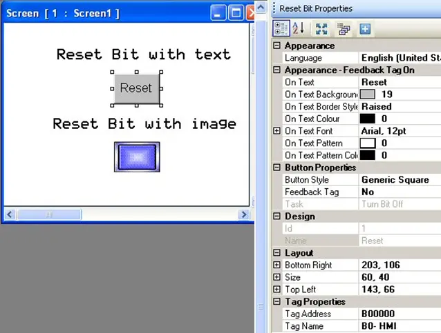
Place a Reset Bit button object on screen
- Use one of the following:
- click Draw > Buttons > Bit Action > Reset Bit from the standard menu
- click Quick Buttons > Reset Bit from the Draw toolbar
- click the Reset Bit icon in the Objects toolbar
- Move cursor to a start point for the button object. Click and hold mouse cursor.
- Drag mouse cursor to an end point for the button object and release. The button appears on screen and the Reset Bit Properties box displays.
Reset Bit Properties Options
- Visibility Animation (description) – make the object disappear or become ‘invisible’.
- Language (description) – highlight the language that must be selected to display the entered text.
- Text Alignment (description) – Determines the alignment of the text in relation to the size of the lamp.
- Transparency – Sets the object as transparent or not.
- Appearance Feedback Tag On/Off (description) – select the On and/or Off labels.
- Gradient (description) (HMC4000 only) – Allows you to create a gradient for the background of the lamp
- Button Style (description) – selects a style or ‘look’ to the button.
- Feedback Tag (description) – enable this feature and select the same tag for both the target address and the feedback tag address, if you wish to see the button change state (i.e. go from an ‘off’ or untouched look to an ‘on’ or touched look).
- Simulation – select ‘On/Off’ to see how button looks in that state (only available if Feedback Tag is ‘Yes’).
- Task – turn Bit Off (cannot be modified)
- Design (description) – identifies object.
- Layout (description) – coordinates (i.e. size and position) for the object.
- Tag Name (description) – this is the tag name of the target bit/coil that is reset.
Resize a Reset Bit button object
Move the mouse pointer over one of the resize handles. When the pointer changes to a double-headed arrow, simply click and drag to a new location.
Momentary Bit
The Momentary Bit button sets a targeted bit/coil on while the button is being pressed and resets the bit/coil when the button is released. The button displays with either text labels or a graphic image to represent two states. When a momentary bit button is on screen, the HMC continuously polls the target bit register to determine which state to display (feedback tag must be enabled to display two states).
Place a Momentary Bit button object on screen
- Use one of the following:
- click Draw > Buttons > Bit Action > Momentary Bit from the standard menu
- click Quick Buttons > Momentary Bit from the Draw toolbar
- click the Momentary Bit icon in the Objects toolbar
- Move cursor to a start point for the button object. Click and hold mouse cursor.
- Drag mouse cursor to an end point for the button object and release. The button appears on screen and the Set Bit Properties box displays.
Set Momentary Properties Options
- Visibility Animation (description) – make the object disappear or become ‘invisible’.
- Language (description) – highlight the language that must be selected to display the entered text.
- Text Alignment (description) – Determines the alignment of the text in relation to the size of the lamp.
- Transparency – Sets the object as transparent or not.
- Appearance Feedback Tag On/Off (description) – select the On and/or Off labels.
- Gradient (description) (HMC4000 only) – Allows you to create a gradient for the background of the lamp
- Button Style (description) – selects a style or ‘look’ to the button.
- Feedback Tag (description) – enable this feature and select the same tag for both the target address and the feedback tag address, if you wish to see the button change state (i.e. go from an ‘off’ or untouched look to an ‘on’ or touched look).
- Simulation – select ‘On/Off’ to see how button looks in that state (only available if Feedback Tag is ‘Yes’).
- Task – Momentary Bit (cannot be modified)
- Design (description) – identifies object.
- Layout (description) – coordinates (i.e. size and position) for the object.
- Tag Name (description) – this is the tag name of the target bit/coil that is set.
Resize a Momentary Bit button object
Move the mouse pointer over one of the resize handles. When the pointer changes to a double-headed arrow, simply click and drag to a new location.

Toggle Bit
The Toggle Bit button alternates setting and clearing a targeted coil each time the button is pressed. When pressed by the operator, the HMC reads the current value of the coil, and then sends a command to set or reset the coil depending upon the value read. The button shows text labels or a graphic image that is used to represent two states. When a toggle bit button is on screen, the HMC continuously polls the target bit register to determine which state to display (feedback tag must be enabled to display two states).
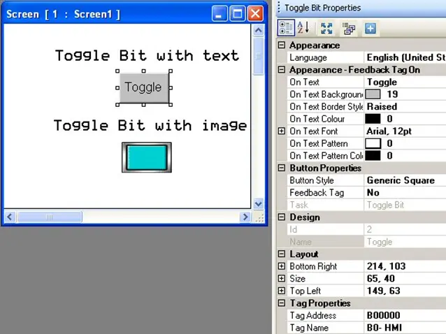
Place a Toggle Bit button object on screen
- Use one of the following:
- click Draw > Buttons > Bit Action > Toggle Bit from the standard menu
- click Quick Buttons > Toggle Bit from the Draw toolbar
- click the Toggle Bit icon in the Objects toolbar
- Move cursor to a start point for the button object. Click and hold mouse cursor.
- Drag mouse cursor to an end point for the button object and release. The button appears on screen and the Toggle Bit Properties box displays.
Toggle Bit Properties Options
- Visibility Animation (description) – make the object disappear or become ‘invisible’.
- Language (description) – highlight the language that must be selected to display the entered text.
- Text Alignment (description) – Determines the alignment of the text in relation to the size of the lamp.
- Transparency – Sets the object as transparent or not.
- Appearance Feedback Tag On/Off (description) – select the On and/or Off labels.
- Gradient (description) (HMC4000 only) – Allows you to create a gradient for the background of the lamp
- Button Style (description) – selects a style or ‘look’ to the button.
- Feedback Tag (description) – enable this feature and select the same tag for both the target address and the feedback tag address, if you wish to see the button change state (i.e. go from an ‘off’ or untouched look to an ‘on’ or touched look).
- Simulation – select ‘On/Off’ to see how button looks in that state (only available if Feedback Tag is ‘Yes’).
- Task – Toggle Bit (cannot be modified)
- Design (description) – identifies object.
- Layout (description) – coordinates (i.e. size and position) for the object.
- Tag Name (description) – this is the tag name of the target bit/coil that is toggled.
Resize a Toggle Bit button object
Move the mouse pointer over one of the resize handles. When the pointer changes to a double-headed arrow, simply click and drag to a new location.

Bit Entry
Bit Entry is used to set/clear a targeted bit/coil. Two predefined messages display according to the current value read in the targeted bit/coil. Messages can be of varying length (maximum of 40 characters). When a bit entry is on a screen that is currently shown on the HMC, the HMC continuously polls the target bit register to determine which message to display.
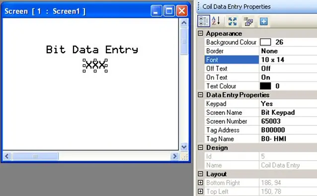
Place a Bit Entry object on screen
- Use one of the following:
- click Draw > Input Objects > Data Entry > Bit Entry from the standard menu
- click Edit Data > Bit Entry from the Draw toolbar
- click the Bit Entry Display icon in the Objects toolbar
- Move cursor to a start point for the button object. Click to place the object on screen.
- The object appears on screen and the Coil Data Entry Properties box displays.
Bit Entry Properties Options
- Visibility Animation (description) – make the object disappear or become ‘invisible’.
- Background Color (description) – option to select a color as a ‘backdrop’ to the object.
- Border (description) – add a line around the perimeter of the object.
- Font (description) – select from one of four options – 5×7, 7×14, 10×14, and 20×28 pixels.
- Off/On Text – message text that appears according to the current value in the target address. Maximum number of characters is 40.
- Text Color – Determines the color of the text. Click to display the color palette.
- Keypad (HMC2000 only) – enable or disable popup keypad input.
Note: if popup keypad input is disabled, entry is still available if a static keypad is placed onto the same screen as this object or on a popup screen. For more information on how to do this, see the section on Screen Keypads.- Screen Name – if a popup keypad is enabled, select which popup keypad to use.
- Screen Number – popup screen assigned to the keypad above.
- Tag Name (description) – this is the tag name of the target bit/coil that is toggled.
- Design (description) – identifies object.
- Layout (description) – coordinates (i.e. size and position) for the object.
Resize a Bit Entry object
The Bit Entry object cannot resize (unless you change the Font attribute) but can move.
Bit Entry object and Popup Screens
The Bit Entry object cannot be placed onto a popup screen – only base and template screens.