
Advanced Objects
Several objects are available in the MAPware software that have advanced features such as executing multiple tasks (Multi-Task buttons), downloading/uploading recipes, and representing data using easy-to-read graphs or meters.

Multi-Task Single-State Button
The Multi-Task Single-State button performs a set of predefined tasks whenever the button is pressed. The button displays with text labels or a graphic image that represents two states. When a Multi-Task Single-State button is on screen, the HMC continuously polls the target bit register to determine which state to display (feedback tag must be enabled to display two states).
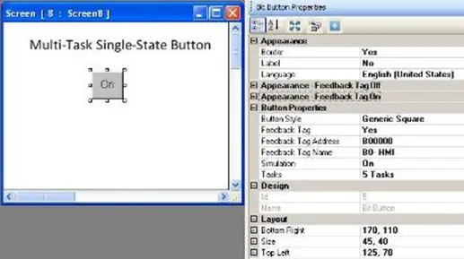
Place a Multi-Task Single-State button on screen
- Use one of the following:
- click Draw > Buttons > Multi-Task Single-State Button from the standard menu
- click Advanced Objects > Multi-Task Single-State Button from the Draw toolbar
- Move cursor to a start point for the button object. Click and hold mouse cursor.
- Drag mouse cursor to an end point for the button object and release. The button appears on screen and the Bit Button Properties box displays.
Multi-Task Single-State Button Properties Options
- Visibility Animation (description) – make the object disappear or become ‘invisible’.
- Border (description)(HMC2000 only) – add a line around the perimeter of the object.
- Label (description)(HMC2000 only) – option to have a label appear on the top/bottom of the object.
- Language (description) – highlight the language that must be selected to display the entered text.
- Text Alignment – Determines the alignment of the text in relation to the size of the button.
- Transparency – Sets the object as transparent or not.
- Appearance Feedback Tag On/Off (description) – select the On and/or Off labels.
- Gradient (HMC4000 only) (description) – Allows you to make the background color a gradient of two colors
- Button Style (description) – selects a style or ‘look’ to the button.
- Enable Control Bit (description) – Enables and disables the Control bit for the button.
- Feedback Tag (description) – Enable this feature and select the same tag for both the target address and the feedback tag address, if you wish to see the button change state (i.e. go from an ‘off’ or untouched look to an ‘on’ or touched look).
- Simulation – select ‘On/Off’ to see how button looks in that state (only available if Feedback Tag is ‘Yes’).
- Tasks (description) – this is the number of tasks performed whenever the button is pressed. Click to display the Touch Screen Tasks List.
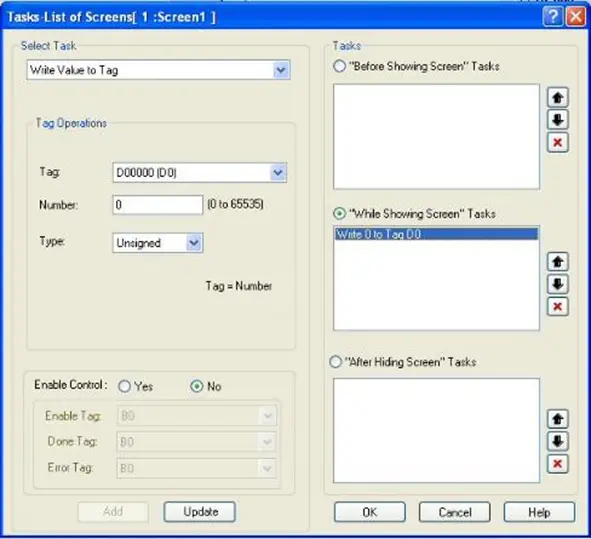
- To add tasks, perform the following steps:
- In the Tasks section, select which touchscreen action you wish to use for the task by clicking the appropriate option. Options are Press Tasks, Pressed Tasks, and Released Tasks.
- Press Tasks – tasks activate as soon as the touchscreen object is touched or pressed. Tasks execute only once.
- Pressed Tasks – these tasks continuously execute as long as the touchscreen button is pressed and held down by the operator.
- Released Tasks – these tasks execute after the operator releases the touched button object.
- Select from the pull-down list box under Select Task and click the task you wish to perform.
- If there are any additional parameters required for the task selected, enter the appropriate information.
- Click the Add button.
- This will add the selected task to the Tasks section.
- Note: to delete a task listed in the Tasks section, simply highlight the task and click the Delete button on your computer keyboard. To modify a task listed in the Tasks section, highlight the task, modify the parameters, and then click the Update button.
- Click OK.
- In the Tasks section, select which touchscreen action you wish to use for the task by clicking the appropriate option. Options are Press Tasks, Pressed Tasks, and Released Tasks.
- Design (description) – identifies object..
- Layout (description) – coordinates (i.e. size and position) for the object.
Resize a Multi-Task Single-State button object
Move the mouse pointer over one of the resize handles. When the pointer changes to a double-headed arrow, simply click and drag to a new location.

Multi-Task Multi-State Button
The Multi-Task Multi-State button performs a set of predefined tasks whenever the button is pressed. The tasks performed depend upon which ‘state’ the button is in when pressed. This button is very similar in operation to the Multi-Task Single-State button described above except that instead of a single state that performs a task(s), you have the option of creating multiple states, each with a unique set of tasks. The button displays with text labels or a graphic image to represent the states. Whenever the button is pressed, the object performs the programmed tasks for that state. The HMC continuously monitors a target tag address to determine which state the button is in.
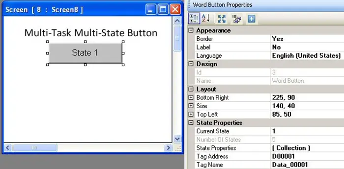
Place a Multi-Task Multi-State button object on screen
- Use one of the following:
- click Draw > Buttons > Multi-Task Multi-State Button from the standard menu
- click Advanced Objects > Multi-Task Multi-State Button from the Draw toolbar
- Move cursor to a start point for the button object. Click and hold mouse cursor.
- Drag mouse cursor to an end point for the button object and release. The button appears on screen and the Word Button Properties box displays.
Multi-Task Multi-State Button Properties Options
- Border (description) (HMC2000 only) – add a line around the perimeter of the object
- Label (description) (HMC2000 only) – option to have a label appear on the top/bottom of the object
- Language (description) – highlight the language that must be selected to display the entered text.
- Text Alignment – Determines the alignment of the text in relation to the size of the button.
- Transparency – Sets the object as transparent or not.
- Design (description) – identifies object..
- Layout (description) – coordinates (i.e. size and position) for the object.
- Current State – shows how the button looks for the currently selected state. Use the pull-down list box (after you have configured the states using the State Properties attribute below) to change the state.
- Number Of States – shows the total number of states configured for this object.
Note: this field cannot change (see State Properties below to add/delete states). - Tag Name (description) – this is the name of the target tag that is monitored by the HMC to determine which state the object is in.
- State Properties – this field configures the states for this object. Click to display the State Properties List.
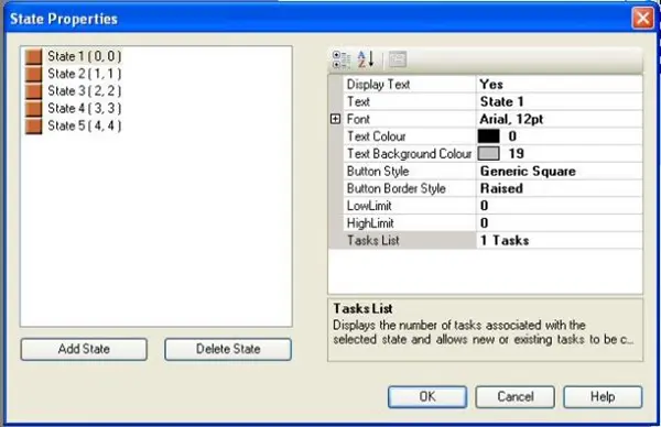
The left side of the State Properties box shows all of the States currently configured. Each word button has a maximum of 32 states.
- Add State – click this button to add a new state (always appended to the bottom of the list)
- Delete State – click one of the States in the list box to highlight and then click this button to delete it.
Note: when deleting a state that is in-sequence, all states listed after the selected states renumber.
The right side of the State Properties box shows the configuration for the highlighted state.
- Button Style – options are Generic Square, Circle, Rounded Rectangle, Invisible, User defined Images, or From Picture Library.
- Display Text – option to display text on the button for that state.
- Font – the text attributes
- High Limit – enter the maximum value associated with this particular state
- Low Limit – enter the minimum value associated with this particular state. Any value read from the target PLC address that is within the Low Limit and High Limit will display this state.
- Tasks (description) – this is the number of tasks performed whenever the button is pressed.
- Text – label applied to that particular state. Default text is ‘Word Button’.
- Text Background Color – determines the fill or background color of the state. Click the button to display the color palette and select a color.
- Text Color – determines the text color. Click the button to display the color palette and select a color.
- Gradient (HMC4000 only) (description) – Allows you to make the background color a gradient of two colors
- Button Border Style – the style or appearance of the button. Options are Raised, Etched, Bump, Sunken, Frame, Flat and None.
Resize a Multi-Task Multi-State button object
Move the mouse pointer over one of the resize handles. When the pointer changes to a double-headed arrow, simply click and drag to a new location.

Bar Graph
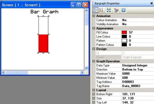
The Bar Graph object represents values in an 8/16/32-bit register as a single bar chart whose proportional length corresponds to the quantity in the register. A bar graph can be configured to move in any direction (i.e. left to right, bottom to top, etc.) and monitor the target register as a signed/unsigned integer, BCD, or floating-point value. You can also employ special effects such as dynamic fill color or visibility.
Place a Bar Graph object on screen
- Use one of the following:
- click Draw > Display Objects > Bar Graph from the standard menu
- click Advanced Objects > Bar Graph from the Draw toolbar
- click the Bar Graph icon in the Objects toolbar
- Move cursor to a start point for the bar graph object. Click and hold mouse cursor.
- Drag mouse cursor to an end point for the bar graph object and release. The object appears on screen and the Bar Graph Properties box displays.
Bar Graph Properties Options
- Color Animation (description) – dynamically change the color of the object.
- Visibility Animation (description) – make the object disappear or become ‘invisible’.
- Fill Color – select the color that represents relative value in target register
- Line Color (description) – sets color of the perimeter line.
- Pattern – this is an option to use two colors for the fill color. The pattern determines how the two colors show. Eight patterns are available. Click to display the pattern options.
- Pattern Color – Select the second fill color when using the pattern option above. Click to display the color palette.
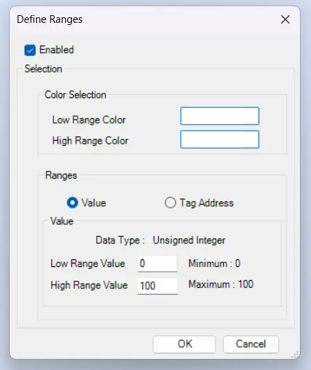
- Define Ranges (HMC2000 only) – Allows you to change the main color of the bar graph at particular value ranges
- Enabled – Enables color changing on values
- Color Selection – Allows you to define which colors are associated with the high and low ranges
- Ranges – Allows you to set the values that are defined for the colors selected above. You can either hard-code low and high range values, or associate each range value with a tag
- Gradient (HMC4000 only) (description) – Allows you to make the background color a gradient of two colors
- Design (description) – identifies object.
- Data Type (description) – select the data format used for the values associated with the graph.
- Direction – determines in which direction the graph moves as it tracks the target value. Options are Left to Right, Right to Left, Bottom to Top, and Top to Bottom.
- Style – Defines the style of the bar graph. Allows the choice of “Style 1” which is a rectangular style, and “Style 2” which is a circular style.
- Tag Name (description) – this is the address of target register that is monitored.
- Layout (description) – coordinates (i.e. size and position) for the object.
- Maximum Value – the type selector allows the choice between number (constant) and tag to provide the maximum value of the bar graph
- Minimum Value – the type selector allows the choice between number (constant) and tag to provide the minimum value of the bar graph
- Maximum/Minimum Value – select the limits the bar graph uses to determine the relative level of the graph. The maximum value is a completely filled bar graph. The minimum value is a bar graph with no fill color shown.
Resize a Bar Graph object
Move the mouse pointer over one of the resize handles. When the pointer changes to a double-headed arrow, simply click and drag to a new location.

Multiple Bar Graphs (HMC2000 only)
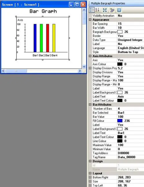
The Multiple Bar Graph object represents up to four consecutive 8/16/32-bit registers as a bar chart whose proportional lengths correspond to the quantity in each register. A multiple bar graph can move in any direction (i.e. left to right, bottom to top, etc.) and monitor the target registers as signed/unsigned integer, BCD, or floating point values. The Multiple Bar Graph object supports title bars, selectable colors, and number designators along the Y-axis.
Place a Multiple Bar Graph object on screen
- Use one of the following:
- click Draw > Display Objects > Multiple Bar Graphs from the standard menu
- click Advanced Objects > Multiple Bar Graphs from the Draw toolbar
- Move cursor to a start point for the Multiple Bar Graphs object. Click and hold mouse cursor.
- Drag mouse cursor to an end point for the Multiple Bar Graphs object and release. The object appears on screen and the Multiple Bar Graphs Properties box displays.
Multiple Bar Graph Properties Options
- Visibility Animation (description) – make the object disappear or become ‘invisible’.
- Bar Spacing – determines the number of pixels between each bar graph
- Bar Width – determines the pixel width of each bar graph.
- Note: the bar width and bar spacing for each bar graph cannot exceed 68 pixels.
- Bar Graph Background Color – determines the background color of the graph. Click the button to display the color palette and select a color.
- Border – optional line around the periphery of the bar chart
- Data Type (description) – select the data format used for the values associated with the graph.
- Label (description) – option to have a text label appear on the top/bottom of the bar graph chart. Click ‘Yes’ to enable.
- Language (description) – highlight the language that must be selected to display the entered text.
- Style – determines in which direction the graph moves as it tracks the target values. Options are Left to Right, Right to Left, Bottom to Top, and Top to Bottom.
- Axis Attributes section – select the options that affect how the Y (vertical) axis displays
- Axis – option to enable/disable the display of a Y-axis
- Axis Color – Select the color used for the Y-axis and number titles. Click to display the color palette.
- Display Division Properties – configure the major/minor division scale points of the axis.
- Major Division – these are the number of major ‘ticks’.
- Note: does not include the baseline (0 axis), minimum value must be 1.
- Minor Division – these are the number of minor ‘ticks’ per major division.
- Note: if minor divisions are not required, select 1
- Major Division – these are the number of major ‘ticks’.
- Display Divisions – option to display the major/minor division scales
- Display Range – option to display a number scale along the Y-axis
- Maximum – sets the maximum value that appears at the top of the scale
- Note: the range allowed depends upon the Data Type selected in the Appearance section (for negative numbers, you must select Signed or Float)
- Minimum – sets the minimum value that appears at the bottom of the scale.
- Maximum – sets the maximum value that appears at the top of the scale
- Label – option to display a heading at the top of the Y-axis
- Label Background Color – determines the fill or background color of the Y-axis label. Click the button to display the color palette and select a color.
- Label Text – enter the text to appear in the Y-axis label
- Label Text Color – determines the text color of the label. Click the button to display the color palette and select a color.
- Bar Attributes – select number of bars, colors, etc.
- Number of Bars – range is 1 to 4 bars. Each bar will correspond to a particular tag register as determined by the Tag Address field below.
- Bar Selected – select the bar you wish to modify/edit using the pull-down box
- Bar Value – this is the height of the selected bar with respect to the other bars in the bar graph (i.e. 100 = 100%, 50 = 50%, etc.). This value shows only when displaying the graph in MAPware; it has no affect during runtime.
- Fill Color – the fill color of the selected bar. Click the button to display the color palette and select a color.
- Label – option to display a text label underneath the selected bar
- Label Text Color – the text color of the label for the selected bar. Click the button to display the color palette and select a color.
- Line Color – the color of the line that encloses the selected bar. Click the button to display the color palette and select a color.
- Maximum Value – the maximum value read from the target register that indicates the selected bar is completely full
- Minimum Value – the minimum value that indicates the selected bar is empty
- Tag Name (description) – this is the tag monitored by the selected bar
- Design (description) – identifies object.
- Layout (description) – coordinates (i.e. size and position) for the object.
Resize a Multiple Bar Graph object
Move the mouse pointer over one of the resize handles. When the pointer changes to a double-headed arrow, simply click and drag to a new location.
Advanced Bar Graph (HMC4000 only)
The Advanced Bar Graph object represents values in an 8/16/32-bit register as a single bar chart whose proportional length corresponds to the quantity in the register. A bar graph can be configured to move in any direction (i.e. left to right, bottom to top, etc.) and monitor the target register as a signed/unsigned integer, BCD, or floating-point value. You can also employ special effects such as dynamic fill color or visibility.
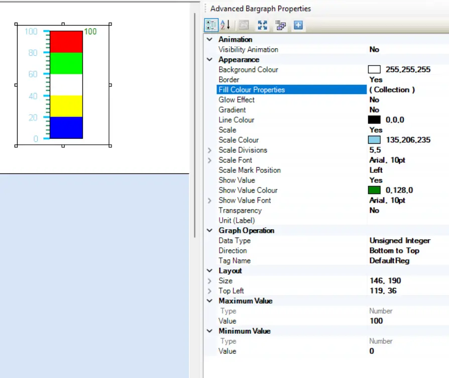
On top of that, the Advanced bar graph offers additional features like a built-in scale indicator, a numeric display of the current bar value, multiple fill colors based on values, as well as a separate background with gradient capability.
Place an Advanced Bar Graph object on screen
click Advanced Objects > Advanced Bar Graph from the Draw toolbar
Move cursor to a start point for the Advanced Bar Graph object. Click and hold mouse cursor.
Drag mouse cursor to an end point for the Advanced Bar Graph object and release. The object appears on screen and the Advanced Bar Graph Properties box displays.
Advanced Bar Graph Properties Options
- Visibility Animation (description) – make the object disappear or become ‘invisible’.
- Background Color (description) – option to select a color as a ‘backdrop’ to the object.
- Border (description) – add a line around the perimeter of the object.
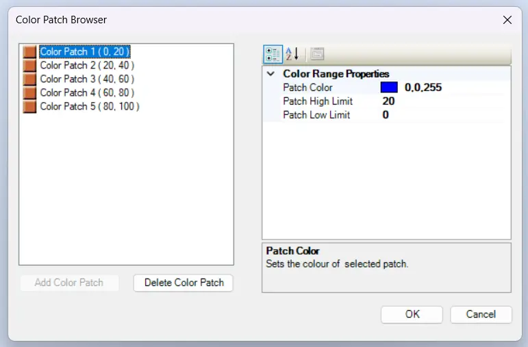
- Fill Color Properties – Open a popup window where you can configure which sections of the bar graph will show which colors
- On the left side, you’ll have a list of current color patches, as well as the ability to add/delete color patches
- On the right side, you’ll be able to configure each color patch
- Patch Color – choose or enter the color of the patch
- Patch High/Low Limit – define the upper and lower bounds of the color patch
- Glow Effect – When enabled, adds a subtle glow effect to the bar graph, making it more visible from extreme angles from the screen
- Gradient (description) – Allows you to make the background color a gradient of two colors
- Line Color (description) – sets color of the perimeter line.
- Scale – Choose whether to display the scale on the y-axis of the bar graph
- Scale Color – Set the Font color of the Scale numbers
- Scale Divisions – Sets the major and minor scale division markers
- Major Division – Sets the number of major division markers on the axis scale.
- Major Division Color – Choose the color of the major division markers
- Minor Division – Sets the number of minor divisions between each major division
- NOTE: the major divisions also count as minor divisions for this number
- Minor Division Color – Choose the color of the minor division markers
- Scale Font (description) – Choose the Font of the Scale Numbers.
- Scale Mark Position – Choose which side of the bar graph the scale numbers will appear on (left or right)
- Show Value – Determines if the current value of the bar graph will be shown
- Show Value Color – Choose the color of the Show value number
- Show Value Font – Choose the Font for the Show number
- Transparency – Sets the object as transparent or not.
- Unit (Label) – Allows you to add text to the end of the show value denoting units
- Data Type (description) – select the data format used for the values associated with the graph.
- Direction – determines in which direction the graph moves as it tracks the target value. Options are Left to Right, Right to Left, Bottom to Top, and Top to Bottom.
- Tag Name (description) – this is the target tag register that is monitored.
- Layout (description) – coordinates (i.e. size and position) for the object.
- Maximum Value – the type selector allows the choice between number (constant) and tag to provide the maximum value of the bar graph
- Minimum Value – the type selector allows the choice between number (constant) and tag to provide the minimum value of the bar graph
- Maximum/Minimum Value – select the limits the bar graph uses to determine the relative level of the graph. The maximum value is a completely filled bar graph. The minimum value is a bar graph with no fill color shown.
Resize an Advanced Bar Graph object
Move the mouse pointer over one of the resize handles. When the pointer changes to a double-headed arrow, simply click and drag to a new location.

Analog Meter
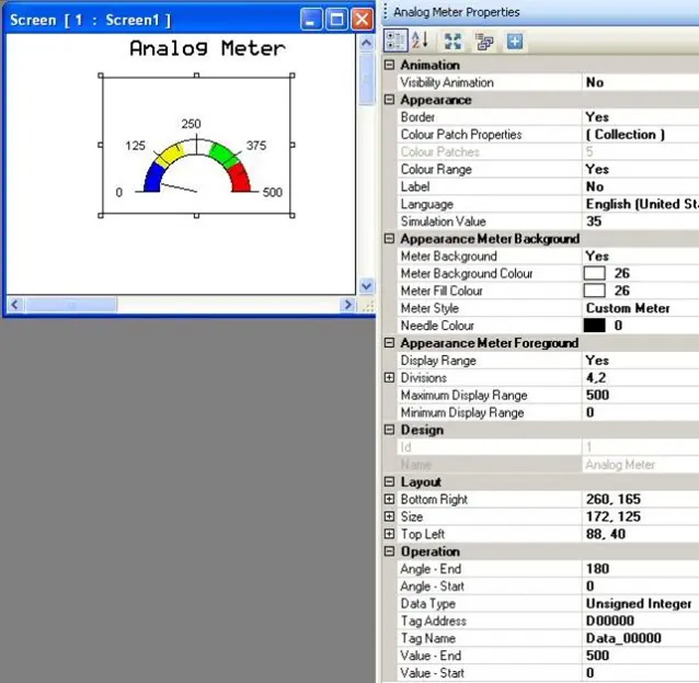
The Analog Meter object represents an 8/16/32-bit register as an analog meter whose angle corresponds to the quantity in a register. The analog meter object supports configurable start/stop angles, scaling label, and multiple color segments. The target register is monitored as a signed/unsigned integer, BCD, or floating-point value. The Analog Meter object supports titles, selectable colors, and number designators.
Place an Analog Meter object on screen
- Use one of the following:
- click Draw > Display Objects > Meter from the standard menu
- click Advanced Objects > Analog Meter from the Draw toolbar
- Move cursor to a start point for the Analog Meter object. Click and hold mouse cursor.
- Drag mouse cursor to an end point for the Analog Meter object and release. The object appears on screen and the Analog Meter Properties box displays.
Options available using the Analog Meter Properties dialog box
- Visibility Animation (description) – make the object disappear or become ‘invisible’.
- Color Patch Properties – use this attribute to determine the colors of each section “patch” of the meter and the high/low limit for each patch. The meter may have as few as one color or as many as five. Color is used to indicate ‘safe’ zones, ‘danger’ zones, or other designations.
- Color Patches – indicates number of color patch segments. To change the total number, edit the Color Patch Properties (see above).
- Label (description) (HMC2000 only) – option to have a text label appear on the top/bottom of the analog meter.
- Language (description) – highlight the language that must be selected to display the entered text.
- Needle Thickness – Defines the thickness of the indicator needle of the meter. Can be a value between 1 and 5
- Simulation Value – this positions the location of the needle during simulation. Value entered should be between the Minimum/Maximum Display Range set.
- Appearance Meter Background
- Meter Background – disable if you wish to display no background (i.e. arc line, color segments, and number axis), only the needle indicator.
- Meter Background Color – select the background color of the meter.
- Meter Fill Color – this is the small ‘pie-shaped’ section directly below the arc line. Select the fill color using the color palette chart.
- Meter Style – options are Advanced, Custom Meter and D-Meter.
- Note: the D Meter is the same as the Custom Meter with the Start Angle set to 0° and the End Angle set to 180°. Select custom meter option to change the starting and ending angles. In the advanced option the meter fills more of the space used by the object and the Angle Style property (see below) can be used to configure the appearance.
- Needle Color – click the button to display the color palette and select a color for the needle.
- Appearance Meter Foreground
- Display Range – option to display the number axis
- Divisions – configure the major/minor division scale points of the axis.
- Major Division – these are the number of major ‘ticks’.
- Note: does not include the baseline (0 axis), minimum value must be 1.
- Minor Division – these are the number of minor ‘ticks’ per major division.
- Note: if minor divisions are not required, select 1.
- Major Division – these are the number of major ‘ticks’.
- Maximum Display Range – sets the maximum value that will appear at the right of the number scale.
- Note: the range allowed depends upon the Data Type selected in the Operation section (for negative numbers, you must select Signed or Float)
- Minimum Display Range – sets the minimum value that will appear at the left of the scale.
- Gradient (description) (HMC4000 only) – Allows you to make the background color a gradient of two colors.
- Design (description) – identifies object.
- Layout (description) – coordinates (i.e. size and position) for the object.
- Operation – these are the parameters for the start/end angles of the meter and the target tag address.
- Angle – End – This is the relative location of the maximum angle on the analog meter. Number is in degrees with reference to 0° located at the leftmost position on the analog meter.
- Angle – Start – This is the relative location of the minimum angle on the meter. Number is in degrees with reference to 0° location.
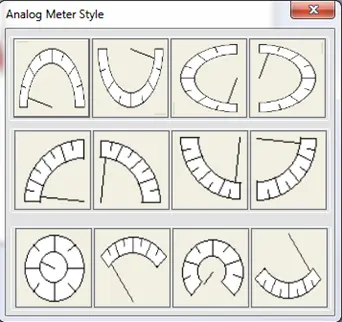
- Angle – Style – This provides a window of preconfigured Start and End angles to use with a meter in the Advance Meter style. Click the ellipse button to get a popup window and select from the various options:
- Click the desired style to select it, the Angle – End and Angle – Start properties are automatically updated when the selection is made.
- Data Type (description) – select the data format used for the values associated with the graph.
- Tag Name (description) – this is the target tag register that is continuously read by the HMC to determine the analog meter needle position.
- Value Start/End – select the limits that are used by the analog meter to show the relative level of the meter. The maximum value has the needle indicator in the maximum position. The minimum value has the needle in the minimum position.
Resize an Analog Meter object
Move the mouse pointer over one of the resize handles. When the pointer changes to a double-headed arrow, simply click and drag to a new location.
Advanced Meter (HMC4000 only)
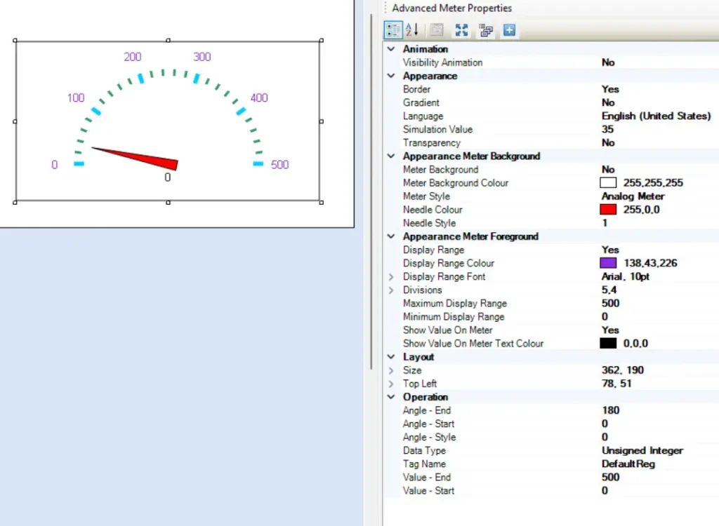
The Analog Meter object represents an 8/16/32-bit register as an analog meter whose angle corresponds to the quantity in a register. The analog meter object supports configurable start/stop angles, scaling label, and multiple color segments. The target register is monitored as a signed/unsigned integer, BCD, or floating-point value. The Analog Meter object supports titles, selectable colors, and number designators.
Place an Advanced Meter object on screen
- Use one of the following:
- click Advanced Objects > Advanced Meter from the Draw toolbar
- Move cursor to a start point for the Advanced Meter object. Click and hold mouse cursor.
- Drag mouse cursor to an end point for the Advanced Meter object and release. The object appears on screen and the Analog Meter Properties box displays.
Options available using the Analog Meter Properties dialog box
- Visibility Animation (description) – make the object disappear or become ‘invisible’.
- Border (description) – add a line around the perimeter of the object.
- Gradient (description) – Allows you to make the background color a gradient of two colors.
- Language (description) – highlight the language that must be selected to display the entered text.
- Simulation Value – this positions the location of the needle during simulation. Value entered should be between the Minimum/Maximum Display Range set.
- Transparency – Sets the object as transparent or not.
- Appearance Meter Background
- Meter Background – disable if you wish to display no background (i.e. arc line, color segments, and number axis), only the needle indicator.
- Meter Background Color – select the background color of the meter.
- Meter Fill Color – this is the small ‘pie-shaped’ section directly below the arc line. Select the fill color using the color palette chart.
- Meter Style – options are Advanced, Custom Meter and D-Meter.
- Note: the D Meter is the same as the Custom Meter with the Start Angle set to 0° and the End Angle set to 180°. Select custom meter option to change the starting and ending angles. In the advanced option the meter fills more of the space used by the object and the Angle Style property (see below) can be used to configure the appearance.
- Needle Color – click the button to display the color palette and select a color for the needle.
- Needle Style – A selection of 4 predefined needle styles you can choose from by entering a number between 1 and 4
- Appearance Meter Foreground
- Display Range – option to display the number axis.
- Display Range Color – Choose the color of the display range font color
- Display Range Font – Choose the font options for the display range
- Divisions – configure the major/minor division scale points of the axis.
- Major Division – these are the number of major ‘ticks’.
- Note: does not include the baseline (0 axis), minimum value must be 1.
- Major Division Color – The color of these major ticks.
- Minor Division – these are the number of minor ‘ticks’ per major division.
- Note: if minor divisions are not required, select 1.
- Minor Division Color – Select the color of these minor ticks
- Major Division – these are the number of major ‘ticks’.
- Maximum Display Range – sets the maximum value that will appear at the right of the number scale.
- Minimum Display Range – sets the minimum value that will appear at the left of the scale.
- Show Value on Meter – Define whether the current value is displayed on the meter.
- Show Value on Meter Text Color – Define the text color of the Show Value number.
- Layout (description) – coordinates (i.e. size and position) for the object.
- Operation – these are the parameters for the start/end angles of the meter and the target tag address.
- Angle – End – This is the relative location of the maximum angle on the analog meter. Number is in degrees with reference to 0° located at the leftmost position on the analog meter.
- Angle – Start – This is the relative location of the minimum angle on the meter. Number is in degrees with reference to 0° location.
- Angle – Style – This provides a window of preconfigured Start and End angles to use with a meter in the Advance Meter style. Click the ellipse button to get a popup window and select from the same options as the Analog Meter above.
- Data Type (description) – select the data format used for the values associated with the graph.
- Tag Name (description) – this is the target tag register that is continuously read by the HMC to determine the analog meter needle position.
- Value Start/End – select the limits that are used by the analog meter to show the relative level of the meter. The maximum value has the needle indicator in the maximum position. The minimum value has the needle in the minimum position.
Resize an Analog Meter object
Move the mouse pointer over one of the resize handles. When the pointer changes to a double-headed arrow, simply click and drag to a new location.