
What is an Object?
Screens and tags, as described in the previous chapters, are not useful in and of themselves. Tags contain data that represent machine operation, but without a means of interacting with this data there is no way for an operator to understand or control what the machine is doing. This chapter explores the various graphic objects a programmer can place on HMC screens, exposing program data to the operator, and fulfilling the Human Machine Interface function of the HMC.
Object List
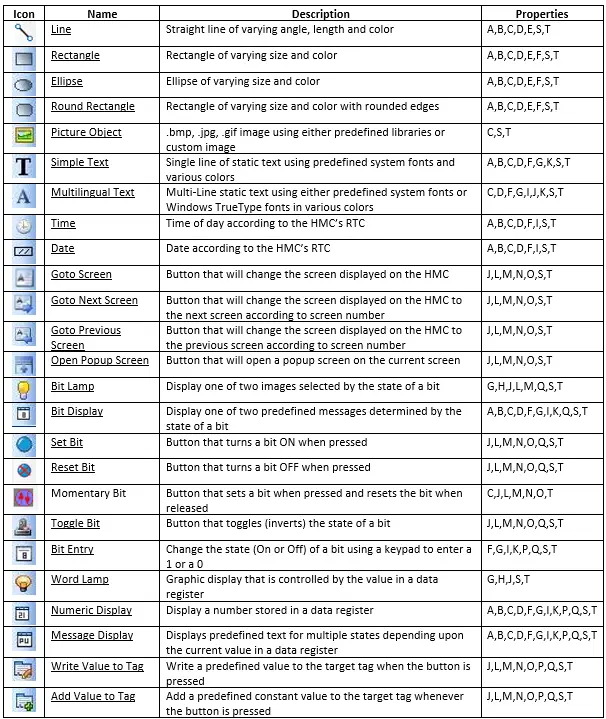
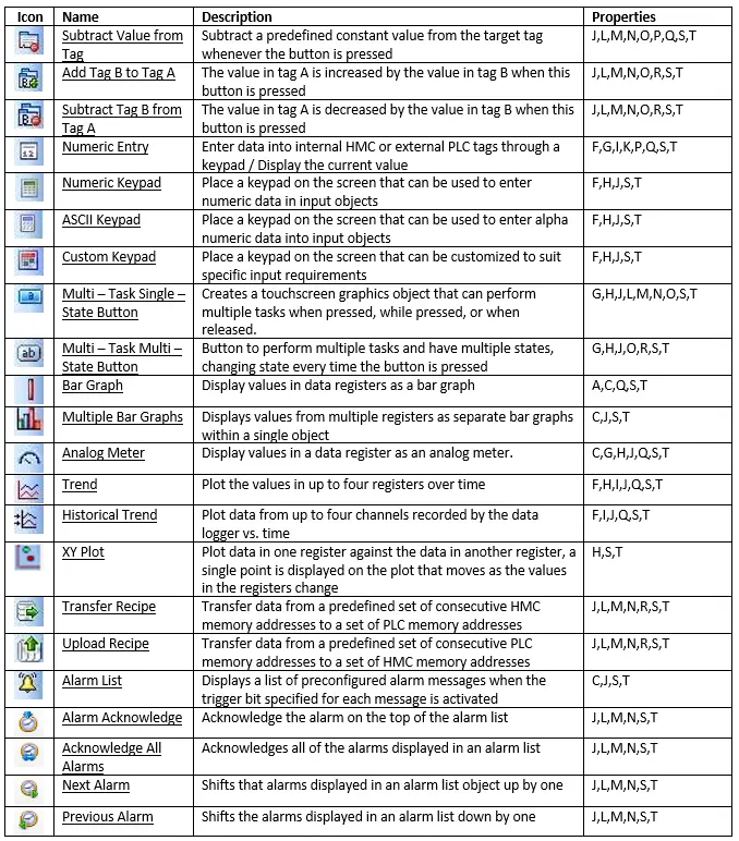
The table below lists all of the objects that can be placed on a screen. Properties available for each object are indicated by letters which refer to the property list in the next section. Information specific to each object is given in the sections that follow.
General Object Properties
Object Properties control an object’s appearance and function. The programmer can configure these properties using the Property Grid which displays the properties of the currently selected object. Most of the objects placed onto a screen share common properties described (for the sake of brevity) in this section. Later sections will examine each individual object in more detail to provide information that may be particular to the operation of that object.
Color Animation
Dynamically change the color of the selected object. The way this is achieved is different on the HMC2000 and HMC4000.
HMC2000
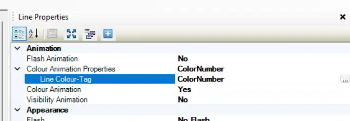
Enter a number between 0-255 (number assigned to each color can be determined by looking at the color palette) to select a color. The default tag is the “DefaultReg”, so you’ll want to select your own tag. In this example, we will enable Color Animation on a Line and select a custom tag named “ColorNumber”:
HMC4000
The HMC4000 is going to have a very similar setup, where you define dynamic colors via tags, but instead of having a single tag that defines the predefined color number, you’ll want to set up 3 tags, one for each of the Red, Green, and Blue channels of the digital color. As before, each will default to “DefaultReg” so you’ll want to create custom tags. In the example, we have Color Animation enabled on a line, and the “Red” channel is set to a custom tag “LineRChannel”
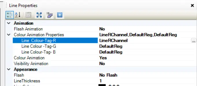
if we write a value of “255” to “LineRChannel”, the line will turn red, just like before.
Flash Animation
Dynamically ‘flash’ selected object. ‘Flash’ means the object displays on screen periodically depending upon the value (0-65535) in a tag register. When enabled, the following options are displayed:
- Flash Animation Properties
- Flash When – determines when flashing should occur. Options are ‘within range’ (flash when the current value is within the set high and low limits) and ‘out of range’ (flash when the current value is above the high limit or below the low limit set).
- High Limit – the upper limit that determines when to flash
- Low Limit – the lower limit that determines when to flash
- Speed – the rate at which flashing occurs when activated. Options are slow (0.5 fps – flashes per second), medium (1 fps), and fast (2 fps).
- Tag List – the default tag register is “DefaultReg” but any WORD type tag can be selected.
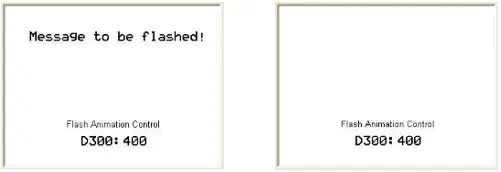
In this example, we will enable Flash Animation on a simple Text object and create the tag “flashTag” as the tag used to control the flashing of the text.
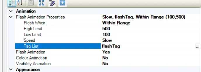
When the value in “flashTag” falls within 100 to 500, the text will slowly flash.
Visibility Animation
Use this feature to make the object disappear. A tag is monitored to determine when the object becomes invisible – made visible only when needed. This helps to reduce clutter on screen and focus the operator’s attention to the area of the screen that is most important. Options are:
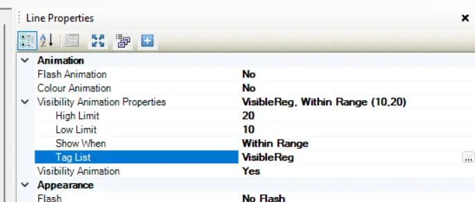
- Visibility Animation Properties
- High Limit – the upper limit determines when to make the selected object invisible.
- Low Limit – the lower limit determines when to make object invisible.
- Show When – determines when visibility should occur. Options are ‘within range’ (show when the current value is within the set high and low limits) and ‘out of range’ (show when the current value is above the high limit or below the low limit set).
- Tag List – The tag that determines the visibility animation, is “DefaultReg” by default.
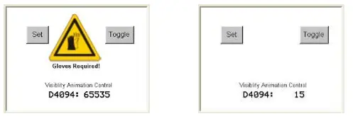
In this example, we enable Visibility Animation on a multilingual Text object and a picture object. create a tag named “VisibleReg” as the tag used to control the visibility of the objects
When the value in “VisibleReg” is outside the range of 10-20, the two objects are visible:
Flash
This is similar to the Flash Animation feature described above except a tag does not control this option. Therefore, if enabled, the Flash feature continues as long as the object displayed.
Options are:
- No Flash – default state. Object will not flash.
- Flash – Slow – Object flashes at 0.5 fps (flashes per second)
- Flash – Medium – Object flashes at 1.0 fps.
- Flash – Fast – Object flashes at 2.0 fps.
Line Color
This determines the color of the perimeter line of a simple shape (i.e. line, rectangle, ellipse, etc.). Use the “…” button to display the color palette to select the color:
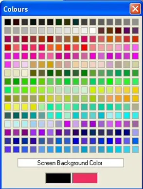
Alternatively, on an HMC4000, you can write in any value between 0-255 for the RGB channels of the color:
: Writing in custom RGB values for a "Line Color"")
Background Color
You can select a background color to simple shapes or many of the other objects that display data. Click the button to use the color palette to select a background color:
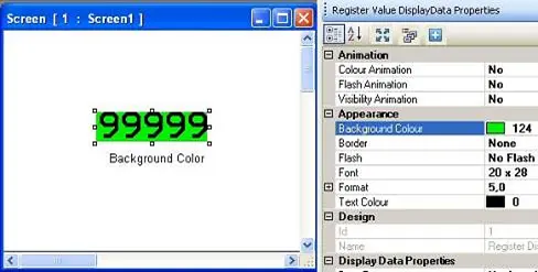
As before, on the HMC4000s, you can enter a custom RGB value instead.
Gradient (HMC4000 only)
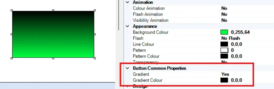
On an HMC4000 model, every button, and some simple drawing objects give you the option to create a gradient as your background color instead of a single solid color. It uses the Background Color as one end of the gradient, and adds a second “Gradient Color” option to serve as the other end of the gradient.
In the example below, we have a Rectangle object with a gradient going from green to black
Border
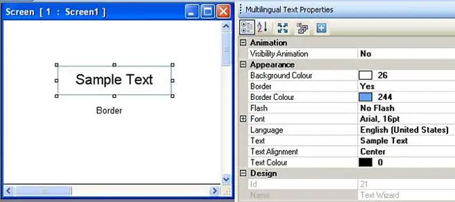
Add a line around the perimeter of the object.
- Border Color – select the color of the border.
Font
Use this to configure the text displayed in the text objects as well as many of the other objects that use text.
Note that some of the objects use a simple predefined font that is not a Windows true type font. This simplified font does not offer as many options listed below as is available for Windows true type fonts. The simplified font does have four options for size: 5×7 pixels, 10×14, 20×28 and 7×14.
True type fonts have the following options:
- Name – Windows type font.
- Size – font size.
- Unit – reserved for future use – not applicable at this time.
- Bold – highlight with bold type.
- GdiCharSet – reserved for future use – not applicable at this time.
- GdiVerticalFont – reserved for future use – not applicable at this time.
- Italic – highlight with italics.
- Strikeout – highlight with strikeout.
- Underline – highlight with underline.
Label
A label identifies the object placed on the top or bottom of the object. Options are:
- Background Color – click the button to select background color.
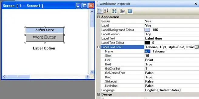
- Position – options are top or bottom of the object.
- Text – enter the text that you wish to appear in the label.
- Text Color – this is the color of the text. Click to display the color palette.
- Text Font – Same as the Font options above.
Language
This feature is the Language feature described later in the multi-language section. This provides the ability to configure each object with a text label for up to nine languages. When the object displays, the HMC selects the language label to show based upon the current value in a particular internal HMC register (the Language tag: SW0001).
Many objects employ the language feature but to use this feature, you must first decide which languages you need then add them to the Languages section. Once completed, you click the pull-down box in this option, select a language, and then configure the text for the object using that language. During normal operation, you can set up buttons on the HMC that will instantly change the ‘language’ (i.e. English, Spanish, German, etc.) of the HMC without the need to download a new project.
Text
This is the entry location where the programmer enters text that will appear in a text object. The size of the display screen and the font size determine the total number of characters permissible. Multiple lines are not allowed.
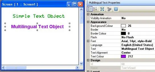
- Text Alignment – This option determines alignment of the text in relation to the size of the text box. Options are Left (justified), Right (justified), and Center (justified).
- Text Color – Determines the color of the text. Click to display the color palette.
Feedback Tag On/Off Text
This option is available on most of the screen button objects. It provides the ability to customize the label that appears on the button.
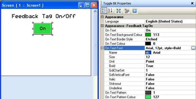
- On/Off Text – entry field for the text that is to appear on the button.
- On/Off Text Background Color – fill color of the button.
- On/Off Text Border Style – there are seven options for the border.
Raised

Etched

Bump

Sunken

Frame

None

Flat

- On/Off Text Color – this is the color of the text. Click to display the color palette.
- On/Off Text Font – these are the particular font size settings for the TrueType font selected.
- On/Off Text Pattern – option to have a two-color pattern for the background.
- On/Off Text Pattern Color – select the secondary color for the patterned background.
Button Style
As with the Feedback On/Off Text described above, this option is available on most button-type objects. Options are:
Generic Square

Circle

Rounded Rectangle

Invisible
Note: the object is active but not seen by the operator

User defined Images
Note: use any *.bmp, *.jpg, or *.gif image

- On/Off State Image – Click the three dot button to locate target graphics image file.
From Picture Library
Note: from predefined libraries included in software

- On/Off State Picture Library – Click the three dot button to display predefined library images.
Enable Control Bit
This feature is optional and exists on button-type objects (i.e. bit control, change screens, write values, alarm buttons, etc.). If enabled, the HMC monitors a selected boolean tag. ‘0’ prevents a new entry, ‘1’ allows normal editing by the operator.
- Enable Control Bit Tag Name – the tag that’s read to determine the object’s enabled state.
Feedback Tag
This feature is optional on most button-type objects (i.e. bit control, change screens, write values, alarm buttons, etc.). If disabled, there is no visual ‘feedback’ that the button, when pressed, has performed its intended function (see Toggle button #1 in illustrations). Therefore, the Appearance – Feedback Tag On section determines what displays on the button.
Enable this feature and select the same tag for both the target tag and the feedback tag, if you wish to see the button change state (i.e. go from an ‘off’ or untouched look to an ‘on’ or touched look). Configure unique labels using the Appearance-Feedback Tag Off/On sections (see Toggle button #2 in illustrations).
Alternatively, select a different feedback tag to verify that some action has taken place in the controller. The controller is then responsible for setting the feedback tag bit, which will then cause the label on the button object to change states (see Toggle button #3 in illustrations).
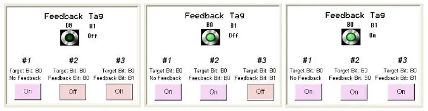
Button #1 is configured with no feedback. Notice that there is no change to how the button looks regardless of whether or not B0 is On or Off.
Button #2 has feedback and both the target and feedback tags are tied to B0. This button changes ‘state’ to reflect the current state of B0.
Button #3 has feedback as well but is using B1 for the feedback tag. As a result, it does not change state depending upon the value in B0. Rather, the look of this button changes according to the value in B1, although the button controls B0.
- Feedback Tag – the tag that’s read to determine which label state to display.
- Simulation – this option simply shows how the ‘On’ state and ‘Off’ state look for the particular object selected, when changed during programming. This option has no effect on operation of the button during online or simulation.
Task(s)
This option is for button-type objects (i.e. Multi-Task Single-State button) that can be configured for more than one task. If the Task is grayed out, this means that the object can do only that one defined task.
A task is some action(s) that the button is programmed to do (see the Task Management section for more information). Click the button with three dots to locate display the Touch Screen Task List dialog box to add/modify the tasks.
Value or Data Properties
This section configures how the selected object interprets (i.e. signed/unsigned, leading zeroes, ranges, etc.) the number it is to display or write.
- Value Data Type – options vary according to the type of the tag selected (BOOL – bit, BYTE – 1 byte, WORD – 2 bytes, REAL – 4 bytes). Options are unsigned, signed, hexadecimal, BCD, binary, Float, ASCII, or ASCII Numeric.
- Unsigned – represents number in target tag as an unsigned decimal number.
- Signed – represents a signed decimal number. Range is -2,147,483,648 to 2,147,483,647 for 4-byte registers, -32768 to 32767 for 2-byte, and 28 to 127 for 1-byte.
- Hexadecimal – represents a hexadecimal (base 16) number. Range is 0 to FFFFFFFF for 4-byte registers, 0 to FFFF for 2-byte, and 0 to FF for 1-byte.
- BCD – represents as a BCD (binary coded decimal) number. Range is – 0 to 99999999 for 4-byte registers, 0 to 9999 for 2-byte, and 0 to 99 for 1-byte.
- Binary – represents as a binary (base 2) number. Range is limited to 16 bits (LSW) for 4-byte registers, 16 bits for 2-byte, and 8 bits for 1-byte.
- Float – represents a floating-point number using the IEEE 754 single precision format. Any number with no more than nine digits can be displayed. If necessary, the number is rounded. Only supported with a 4-byte register tag.
- ASCII – represents the data in a 16 bit number as two ASCII printable characters. Hex values 0-9 display as numbers 0-9, 0AF is displayed as small case decimal numbers, 20-FF is shown as printable ASCII characters. The HMC reads consecutive registers according to the Length field (ex: if Length=10, then HMC will read five consecutive registers, starting with the designated tag.
- ASCII Numbers – same as ASCII (see above) except that all non-printable values display as zeroes.
| Data Type | Range | |
| Target Address (2 bytes) | Target Address (4 bytes) | |
| Unsigned | 0 to 65535 | 0 to 4294967295 |
| Signed | -32768 to 32767 | -2147483648 to 2147483647 |
| Hexadecimal | 0000 to FFFF | 0000 to FFFFFFFF |
| BCD | 0 to 9999 | 0 to 99999999 |
| Binary | 16 bits | 16 bits |
| Floating Point | NA | Maximum of 9 digits |
| ASCII | Max length is 255 chars | Max length is 255 chars |
| ASCII Numeric | Max length is 10 chars | Max length is 10 char |
- Display Leading Zeroes – when enabled, data is presented with leading zeroes to the left of the value, if required to fill in the number of digits specified.
- Hide Data – if enabled, data will be represented with asterisks ‘***’. This feature is for security password entry.
- Keypad (HMC2000 only) – On a Data Entry object, enable or disable popup keypad input.
Note: if popup keypad input is disabled, entry is still available if a static keypad is placed onto the same screen as this object or on a popup screen. For more information on how to do this, see On Screen Keypads later in this chapter.- Screen Name – determines which popup keypad is used.
- Screen Number – screen number of the popup keypad used.
- Ranges (for data entry objects) – these are the limits allowed when entering a new number.
- Maximum Value – enter the maximum value that the HMC operator can enter into the target register.
- Minimum Value – enter the minimum value that the HMC operator can enter into the target register.
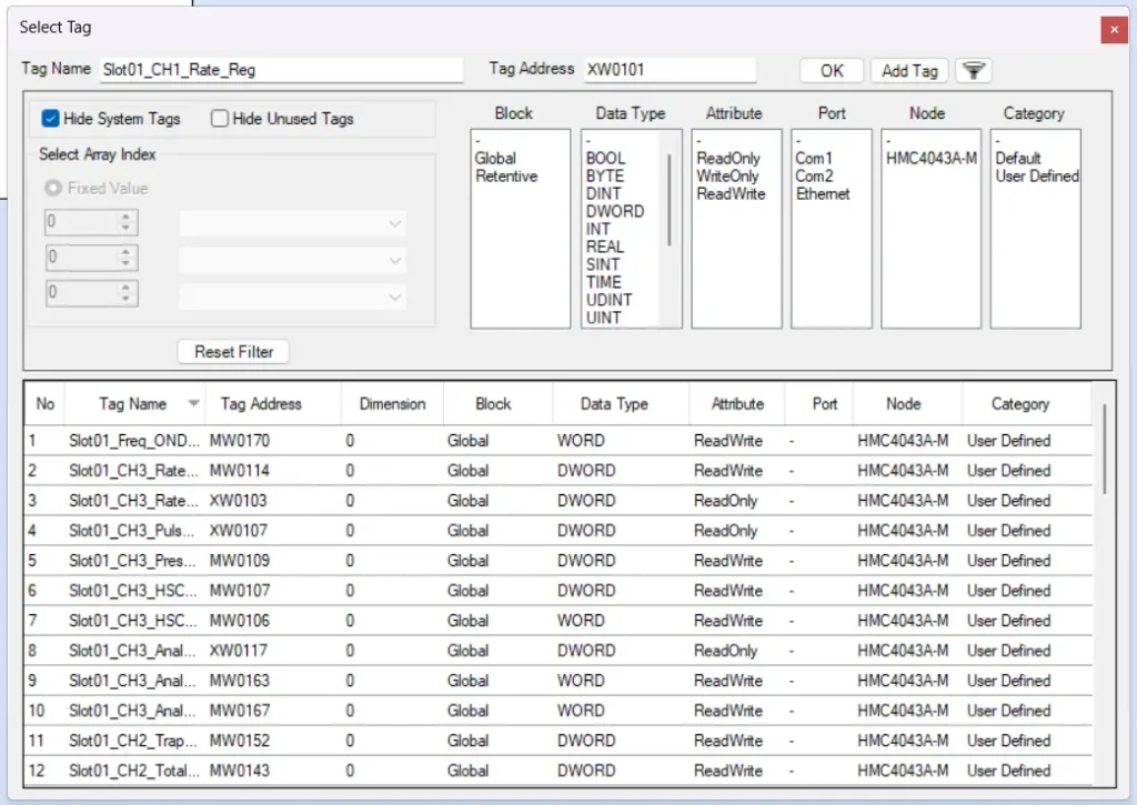
Tag Name
Defines which tag is being attached to the object. Will feature a “…” button that opens a tag selection window like so:
Tag A/B
For objects that perform a mathematical operation on two tags (ex. Add Tag B to Tag A) or copy from one tag to another (i.e. recipes).
Tag A – The tag to act as tag “A” in the operation of the object.
Tag B – The tag to act as tag “B” in the operation of the object.
Design
The programming software uses this section to identify each object. For this reason, the user cannot edit this section.
- Id – this is an identification number assigned to the object.
- Name – this is the name given to the object.
Layout
This section provides the coordinates for the selected object.
- Size – The total size (in pixels) of the selected object. The first value is the width, and second value is height.
- Top Left (or Start Pt.) – location of the start point of the object
- Bottom Right (or End Pt.) – coordinates (pixel location) of the end point of the object
Refer to the above section often when working with screen objects. The next section covers all objects that are placed onto a screen.